Horleys Sculpt
Intelligence over hype
With a love of sport, fitness and health for over 40 years, Horleys have a product range covering the needs of the healthy lifestyle supermarket consumer. Value-added, accessible, easy-to-understand with the jargon taken out, Horleys has built a loyal fanbase. Several sub-brands exist under the Horleys umbrella aimed at different health and activity needs; Sculpt being one of its biggest and well-known female-orientated health nutrition and supplements.
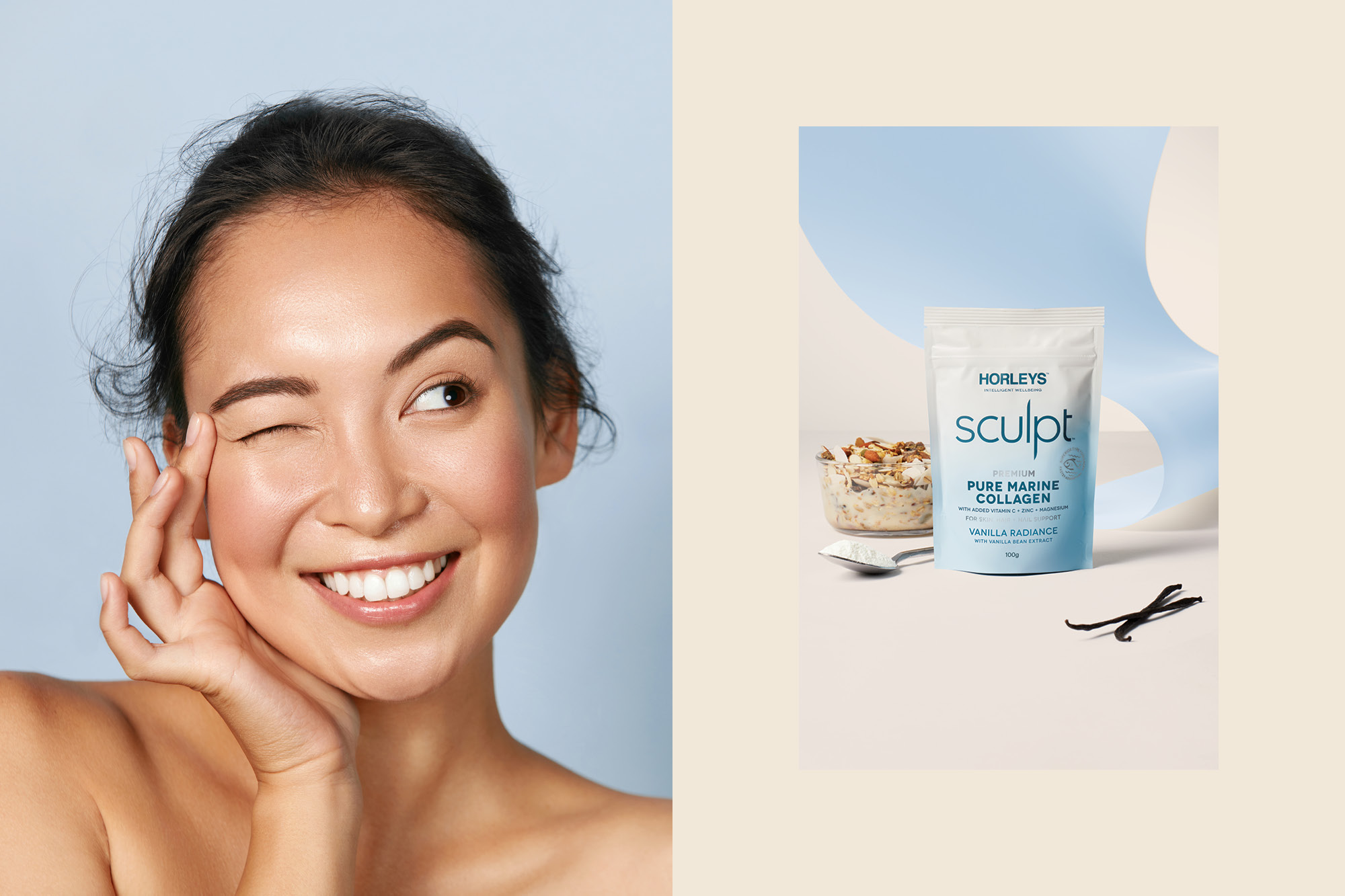
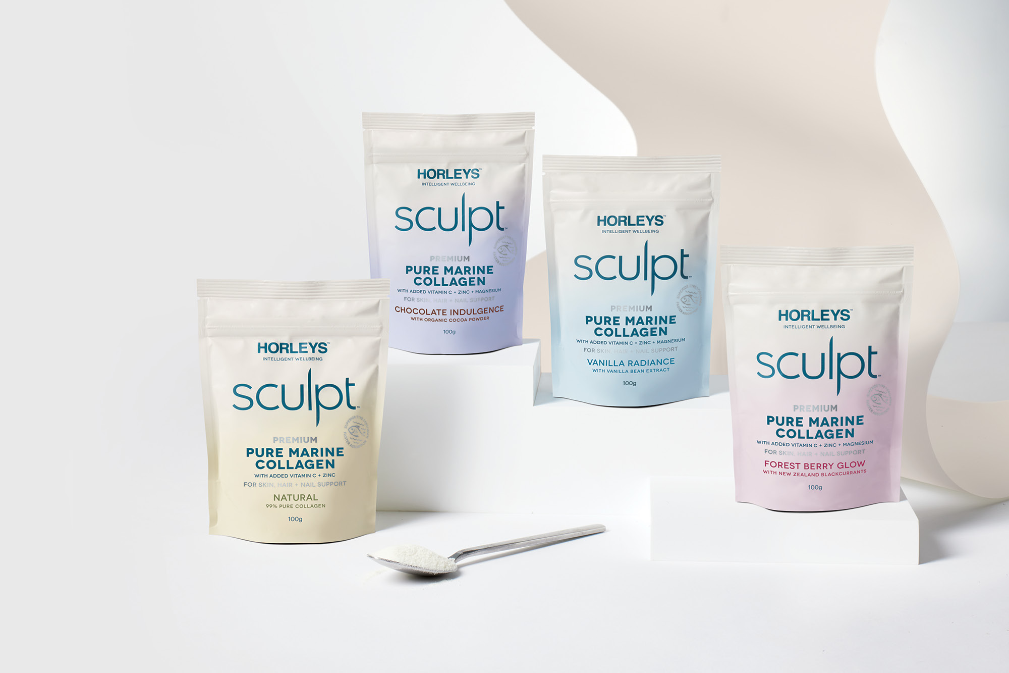
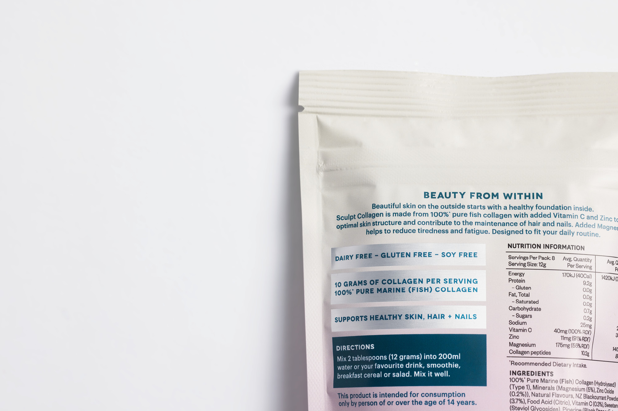
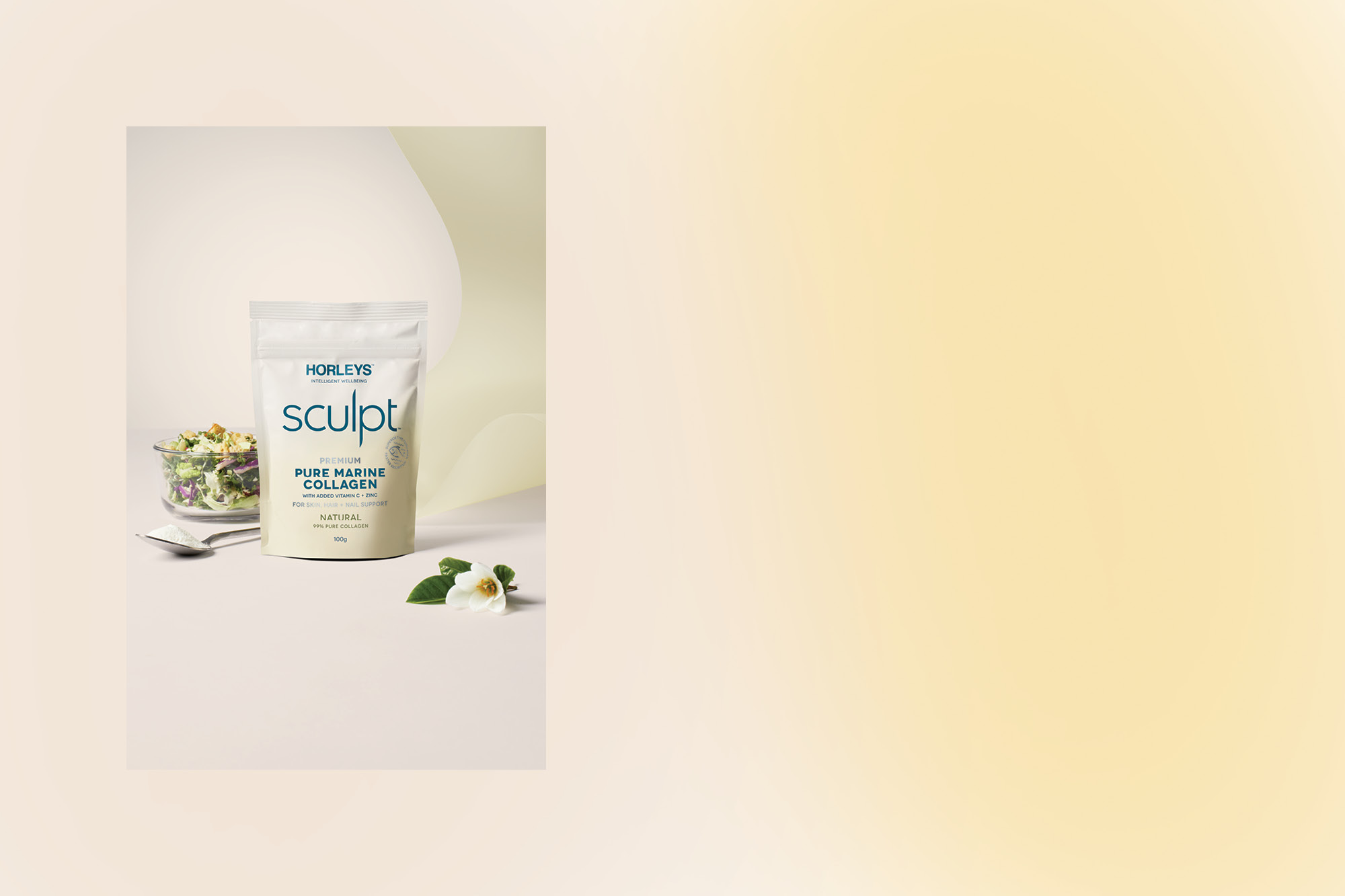
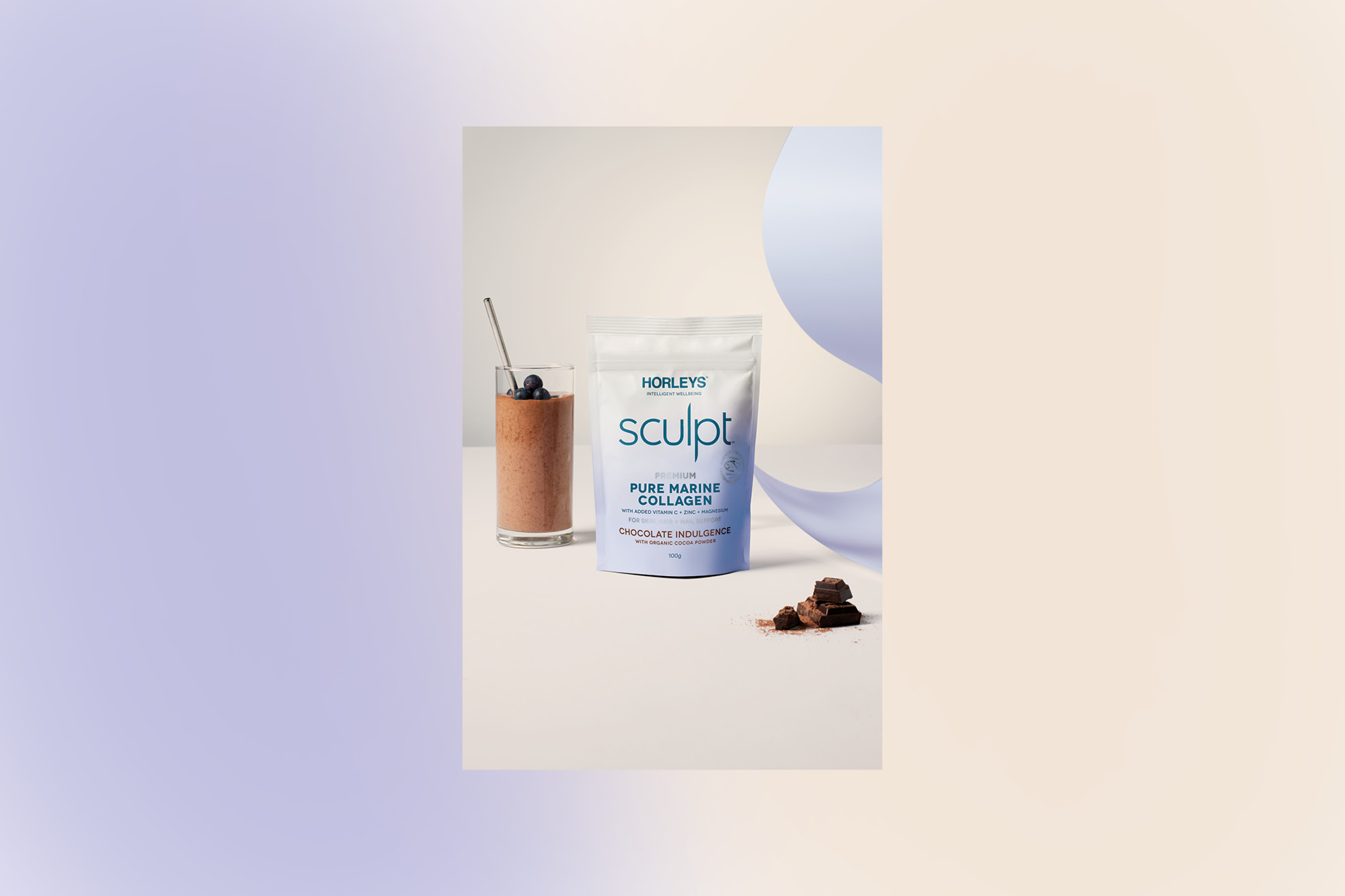
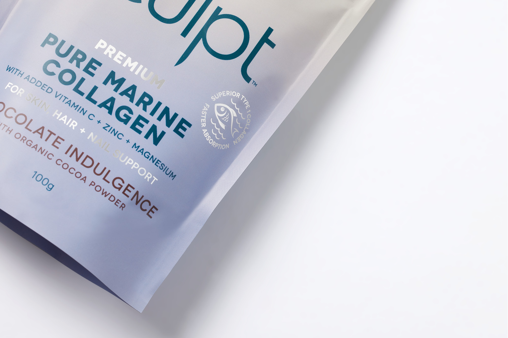
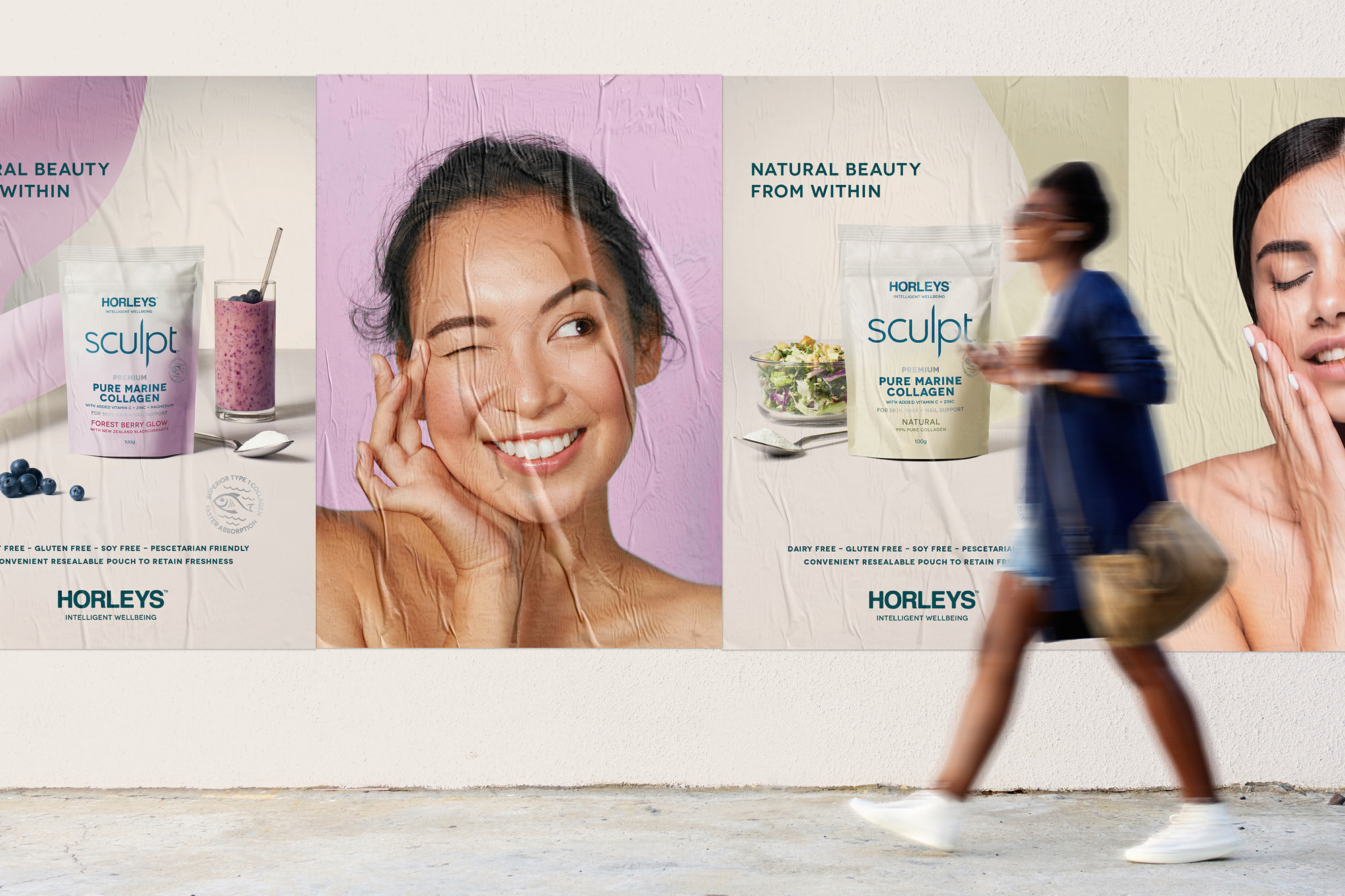
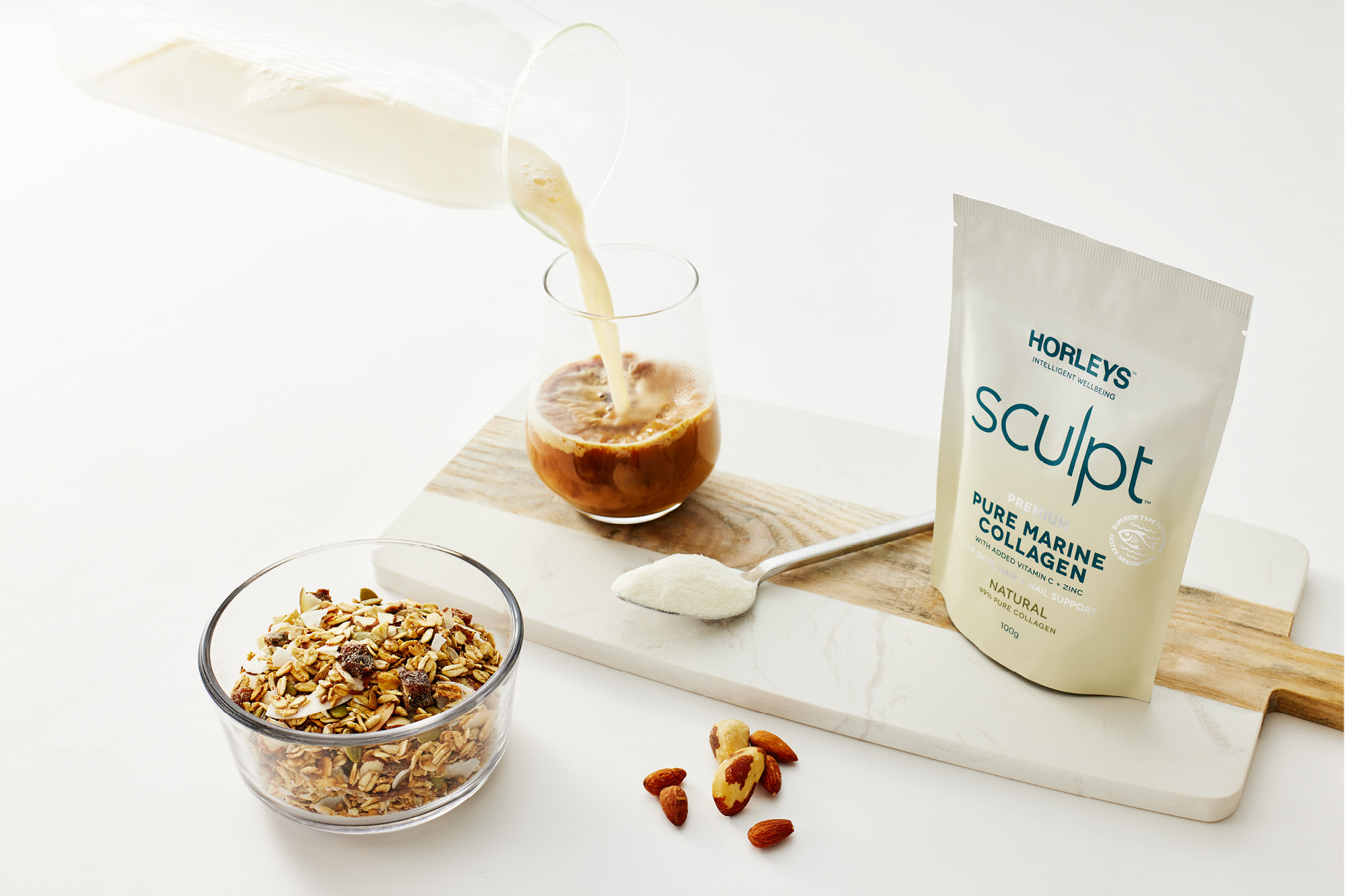
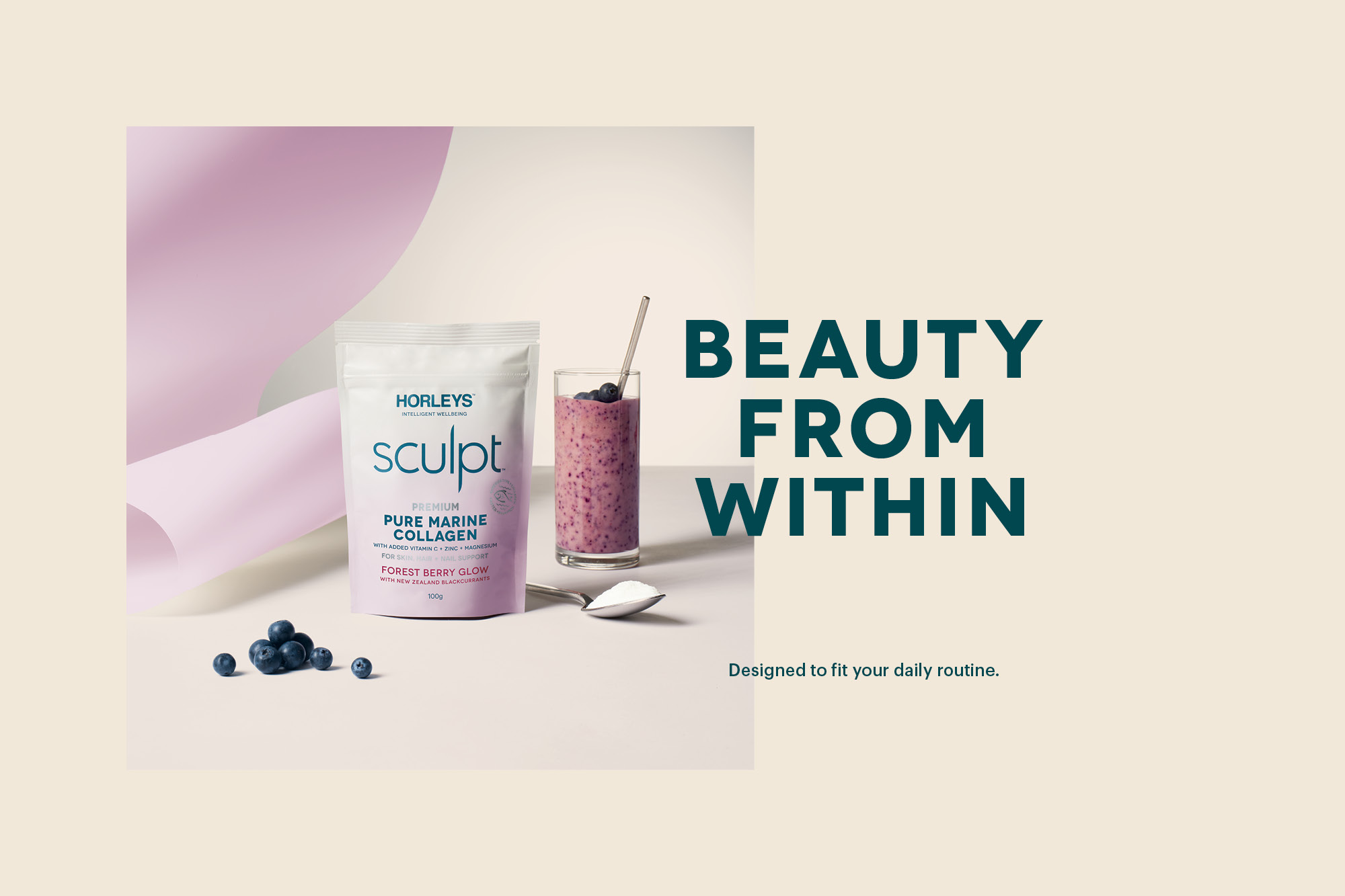
Horleys approached us to relook at Sculpt Collagen, a new premium offering within the sub-brand. While the product delivered a market-leading recipe and health benefits, the packaging, which followed Sculpt’s templated design, lacked the essential beauty orientated language which this consumer would be looking for. Our job was to reinvigorate the pack design, bringing bold and contemporary health and beauty cues. Soft pastel vignettes were used to soften the tone of voice while also creating a strong colour story. Critical product information is formalised in a strong grid system echoing the design language from premium beauty products.
The result is a female-focused design language that disrupts in retail and brings a new lease of life to the Sculpt brand.
