Be Mighty
An attitude of possibilities
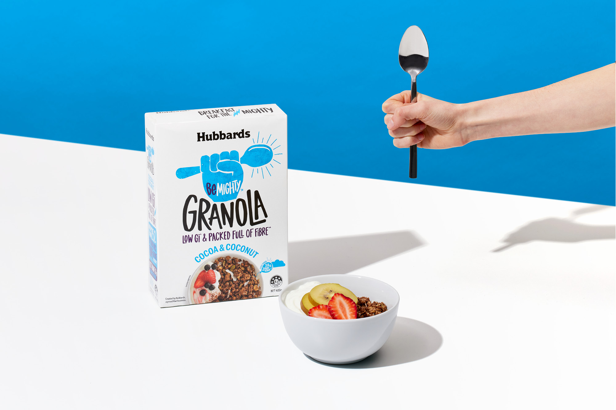
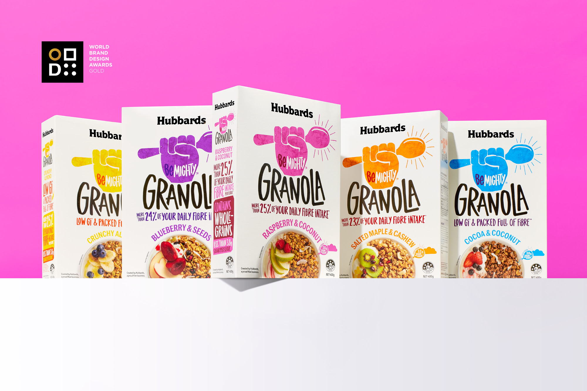
Creating a super tasty granola, packed with fibre and Low GI was right up Hubbards street. Be Mighty is a product range that energises and inspires consumers to go out and get stuff done during their day. This was Hubbards chance to stake a claim in the natural energy category of breakfast foods.
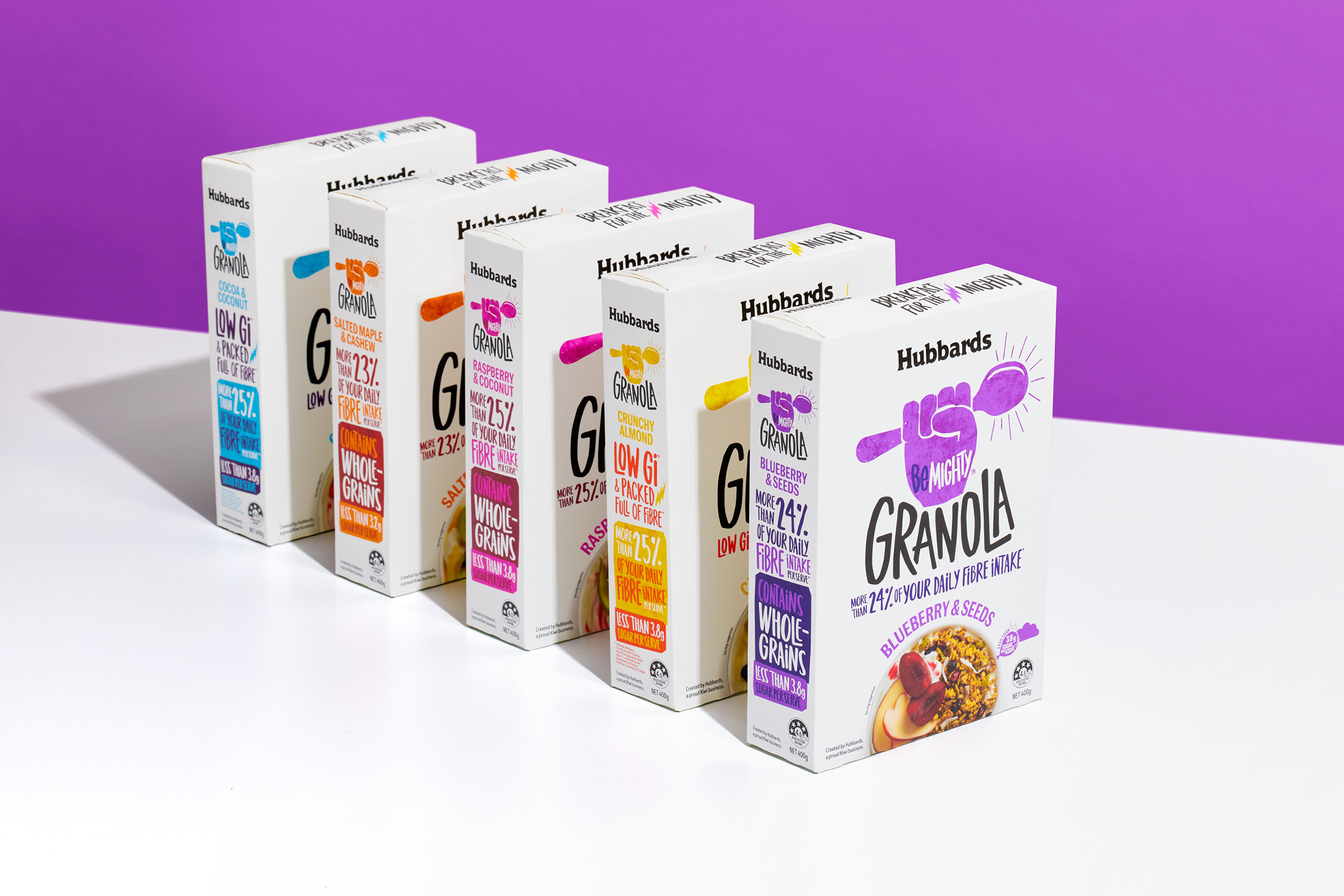
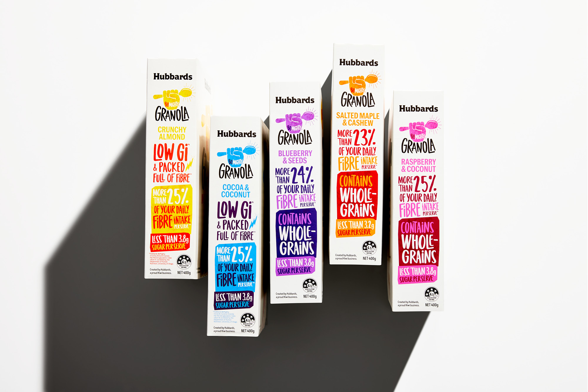
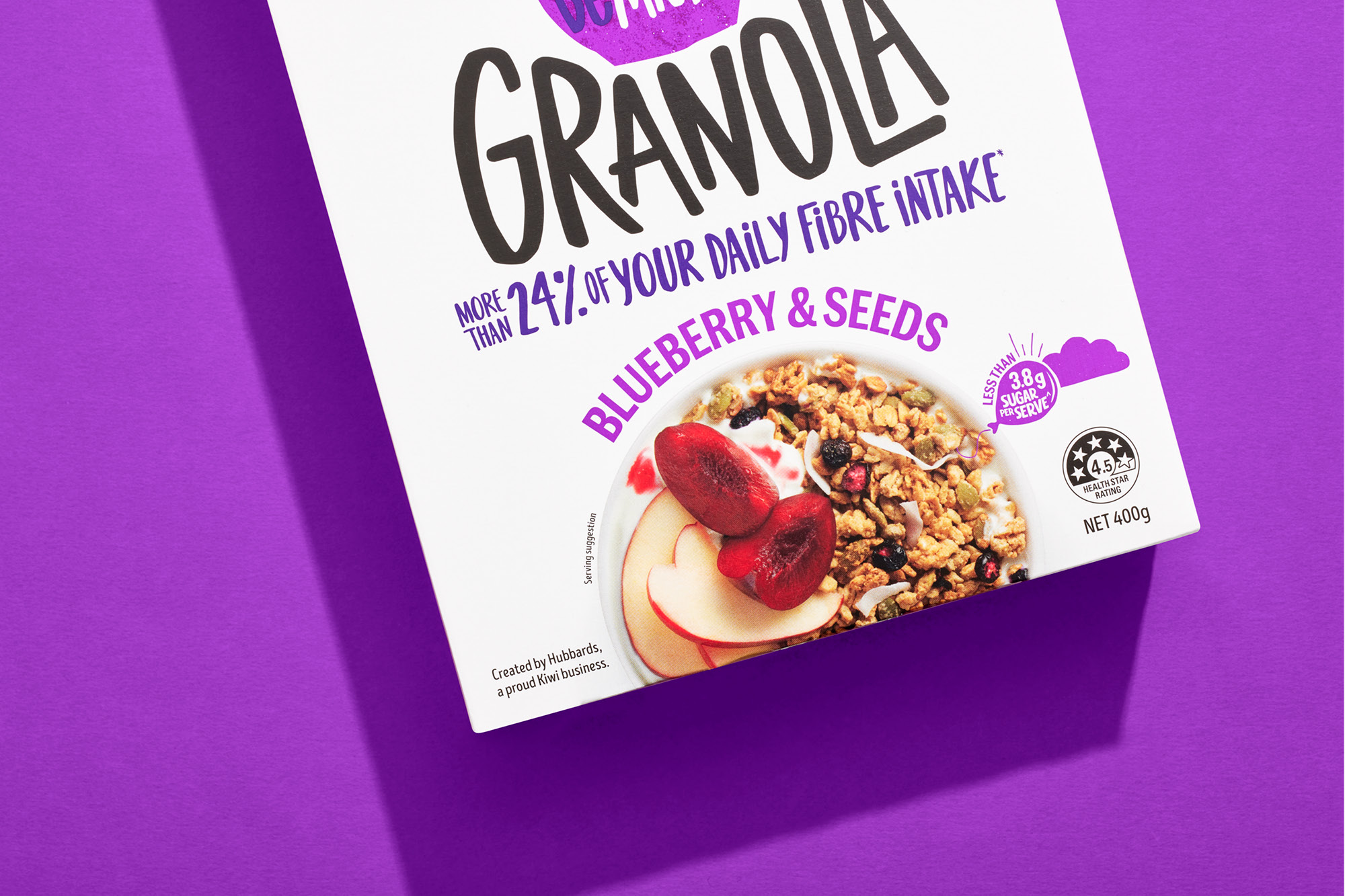
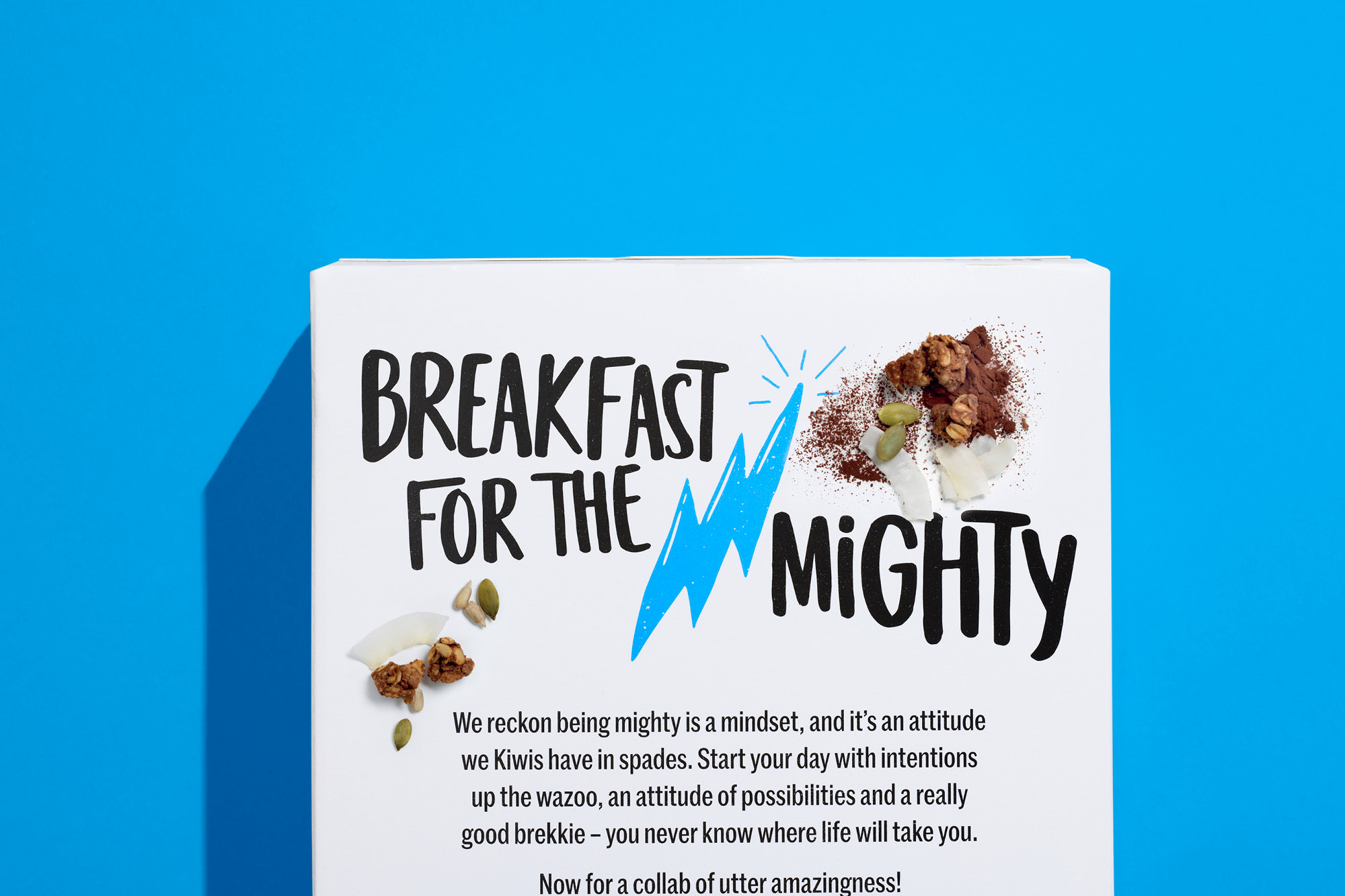
We took this opportunity to turn the new Hubbards brand language up to max. A white pack emphasises the clean energy which is dominated by the universal visual icon of ‘hell yeah!’ - the pumped fist (of course holding a Spoon for eating granola). Bold colours, big expressive type and copywriting that inspires positive thinking breaks category norms and underlines the 'can do' attitude.
Being mighty is a New Zealand mindset, eating Be Mighty fuels that mindset.
Awards:

