Hubbards Simply
The versatile food rockstar
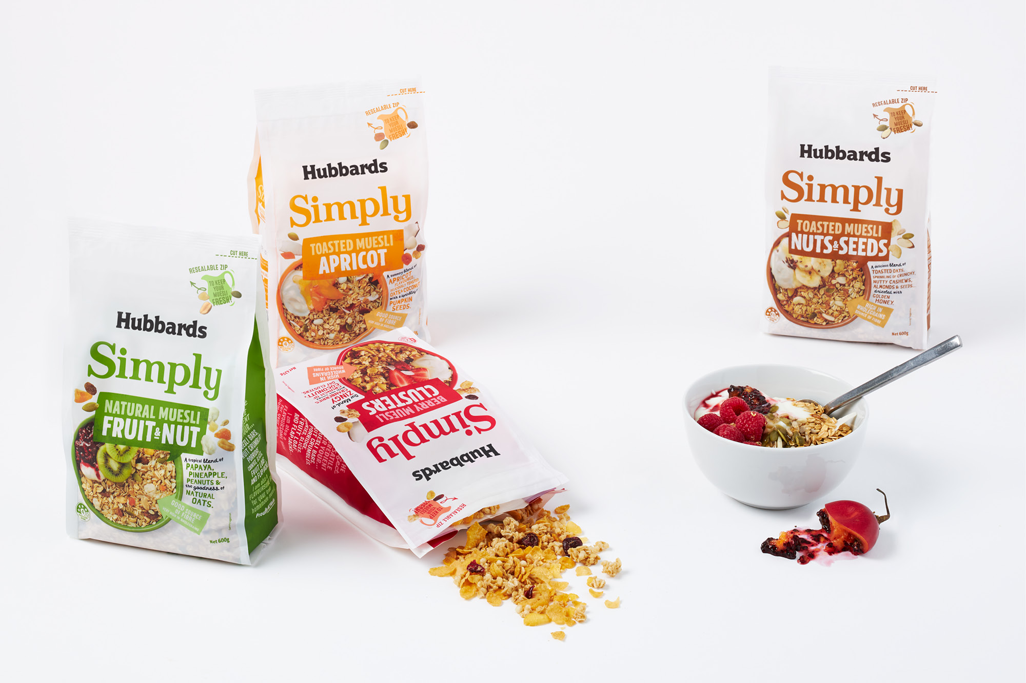
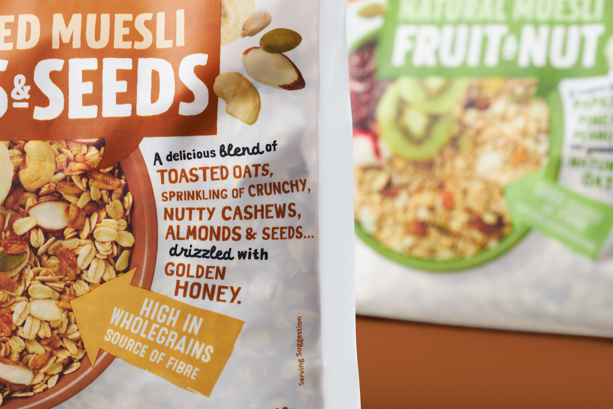
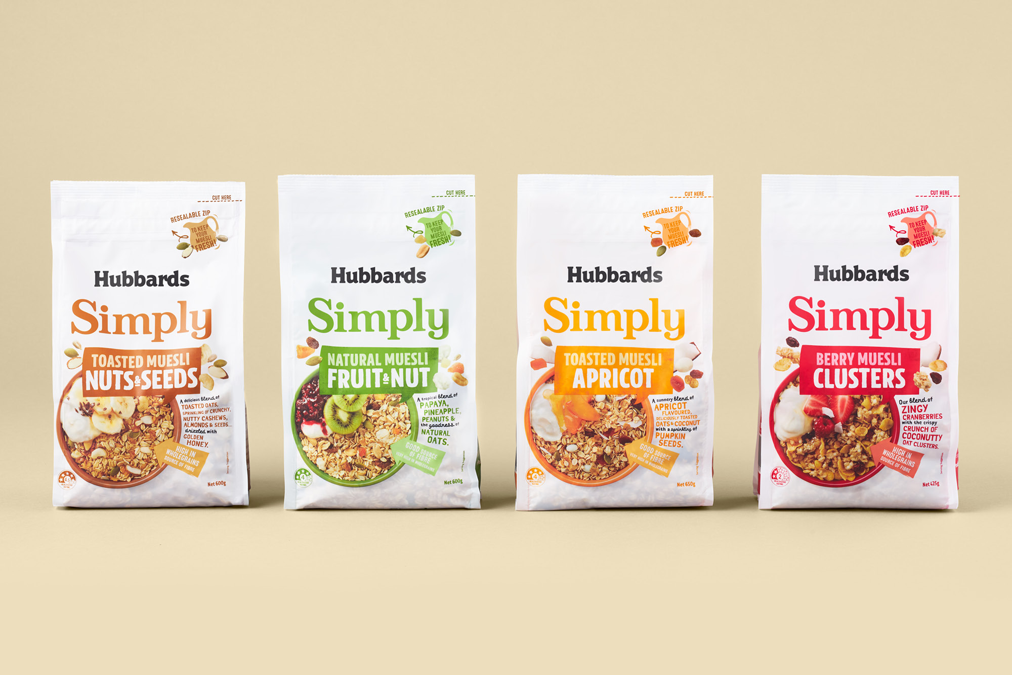
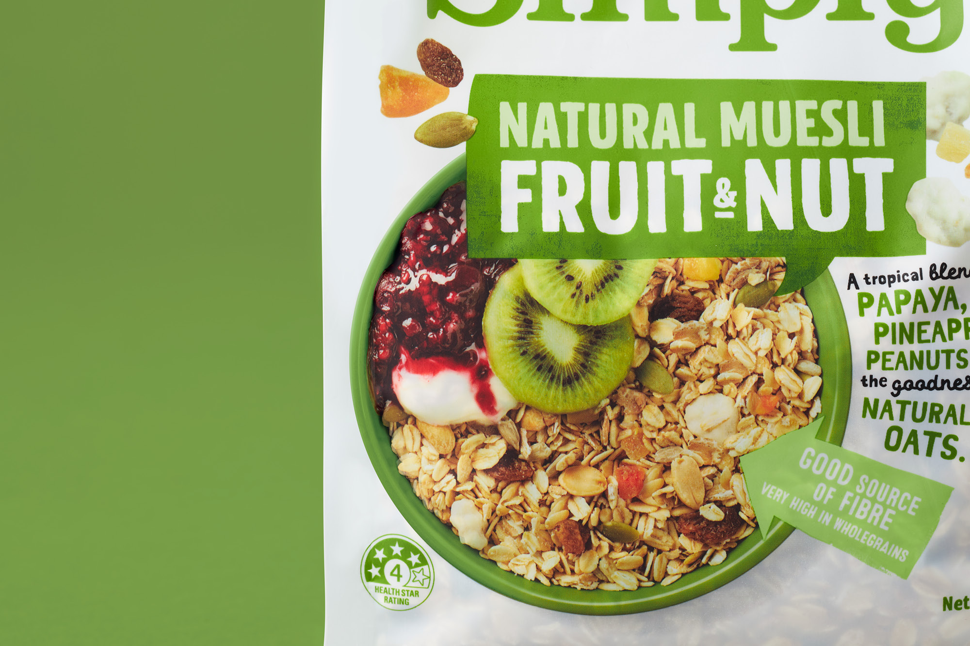
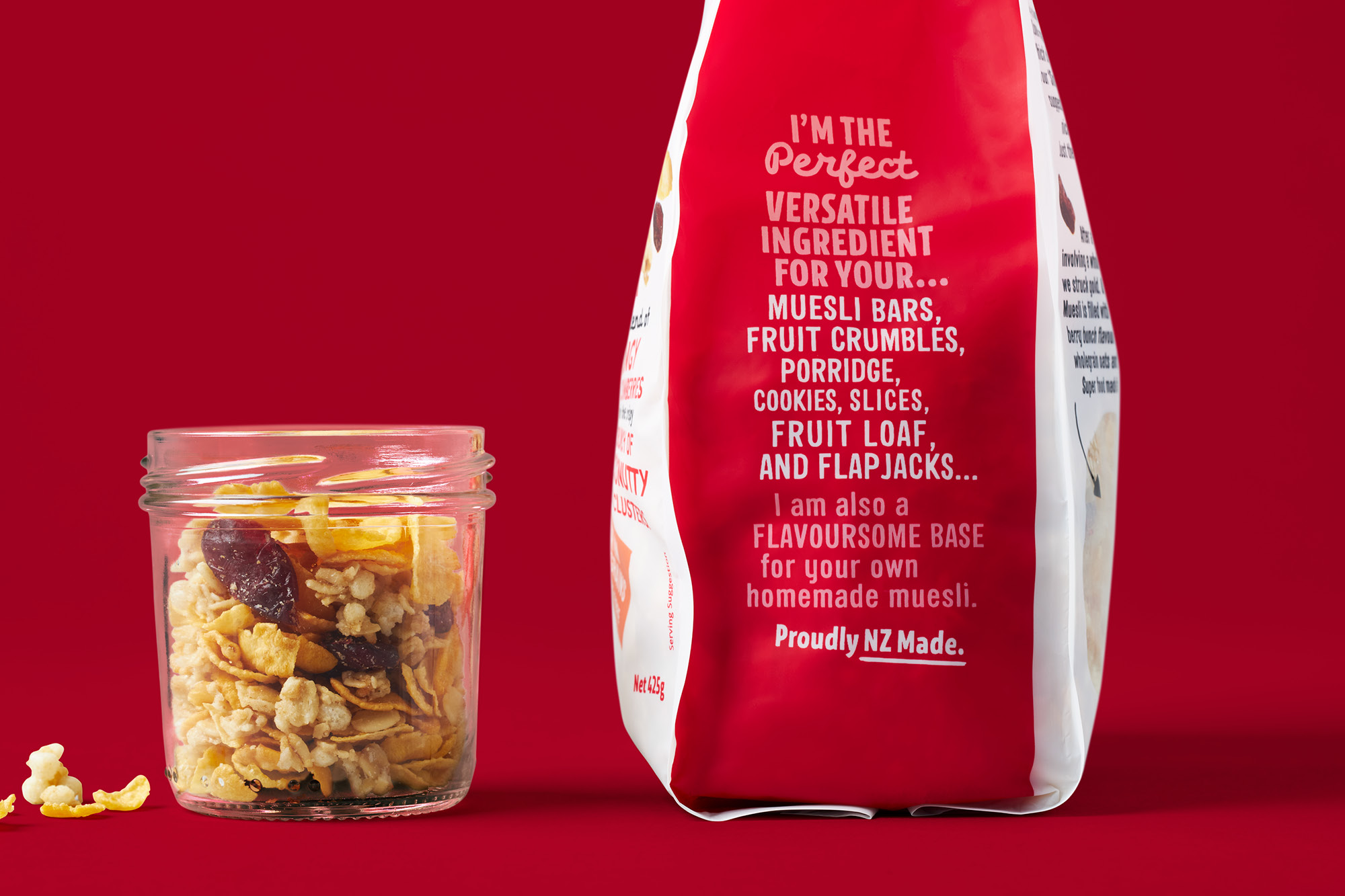
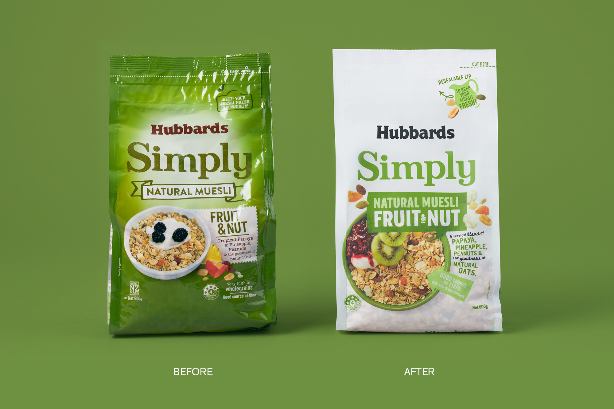
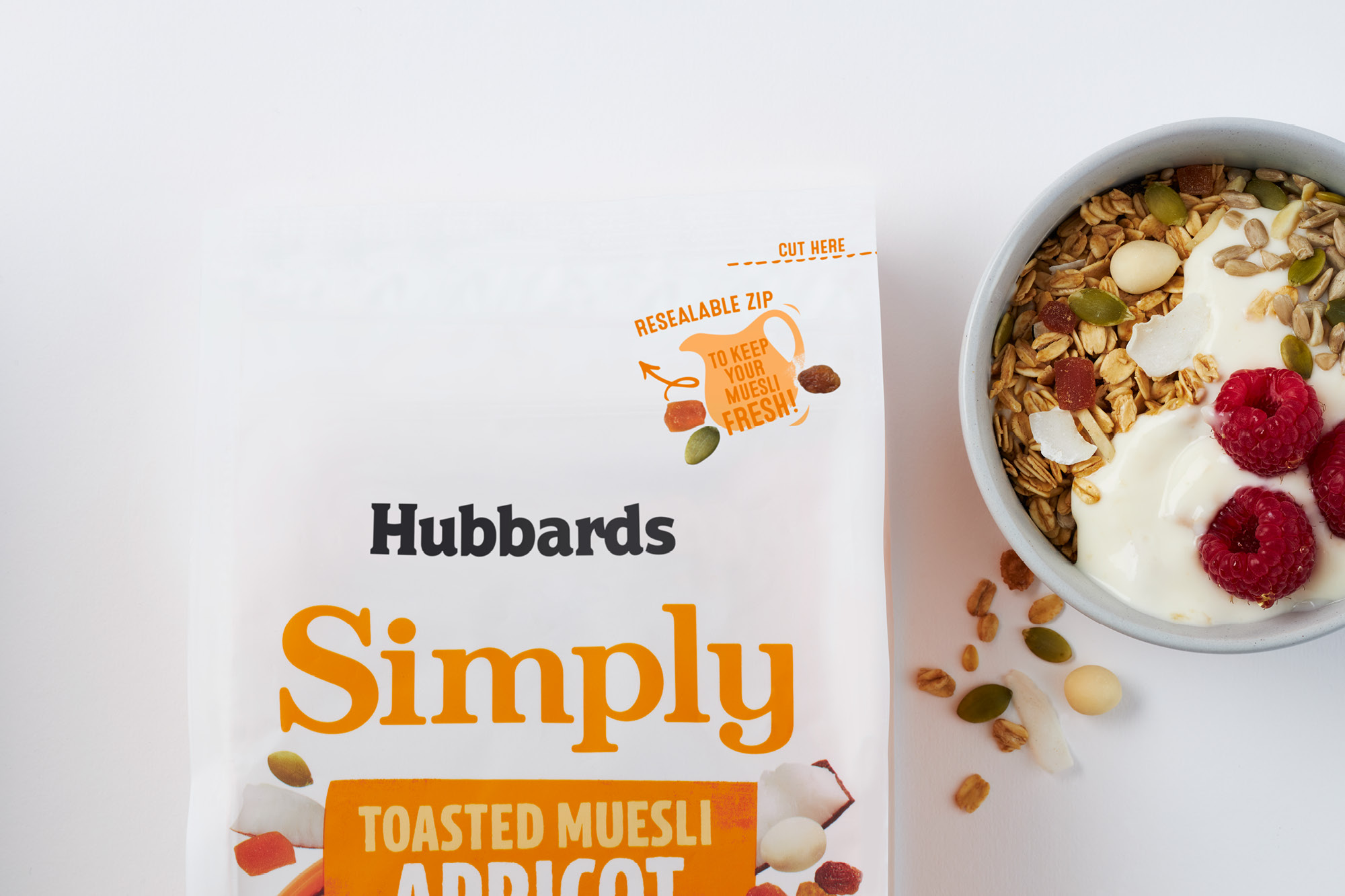
Simply mueslis are the foundation of the Hubbards product offering since the ’90s. As an entry price point into the brand, it is an all-round great eating granola while also popular with bakers using it as a base for all their baked goods. The previous livery lacked the yum factor that the product required for today's demanding breakfast lover, especially in comparison the growth in competitors at the same price point. Our refresh of the range focused on giving each muesli blend the yum factor. Revised product hierarchy combined with detailed macro photography with colour pops of ingredients and serving suggestions elevate the mueslis; these were amplified by using a white background across the whole range which created a large white brand block on retail shelves. Hubbards plucky price fighters are now revitalised with a bright, daring and proud tone-of-voice.
