Legendary Locals
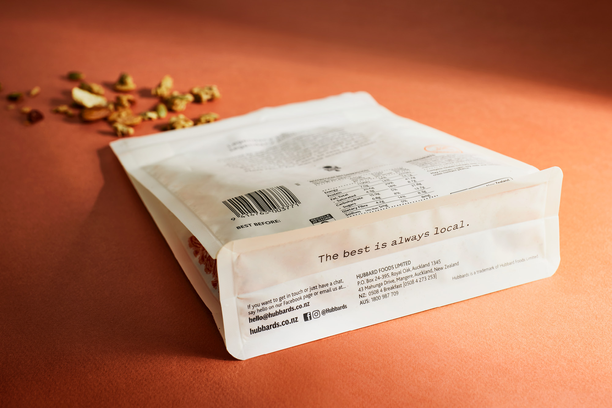
The best is always local
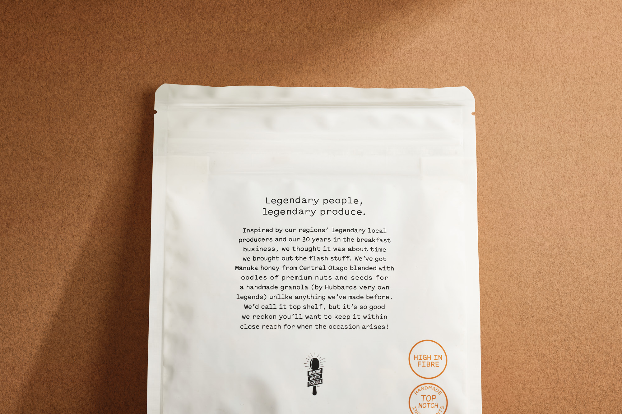
What would Dick do? This question that nods to the founder, Dick Hubbard, is always a yardstick for the brand when creating new breakfast food ideas. This was the deciding factor for Legendary Locals. In their 30 years of making muesli, Hubbards has been up and down the country, trekking the gravel roads to meet local growers who produce the best ingredients. It was time that Hubbards showcased this experience and expertise in a range that catered to the super-premium consumer, seeking the very best taste and texture experience to be found in New Zealand. This is the flash stuff.
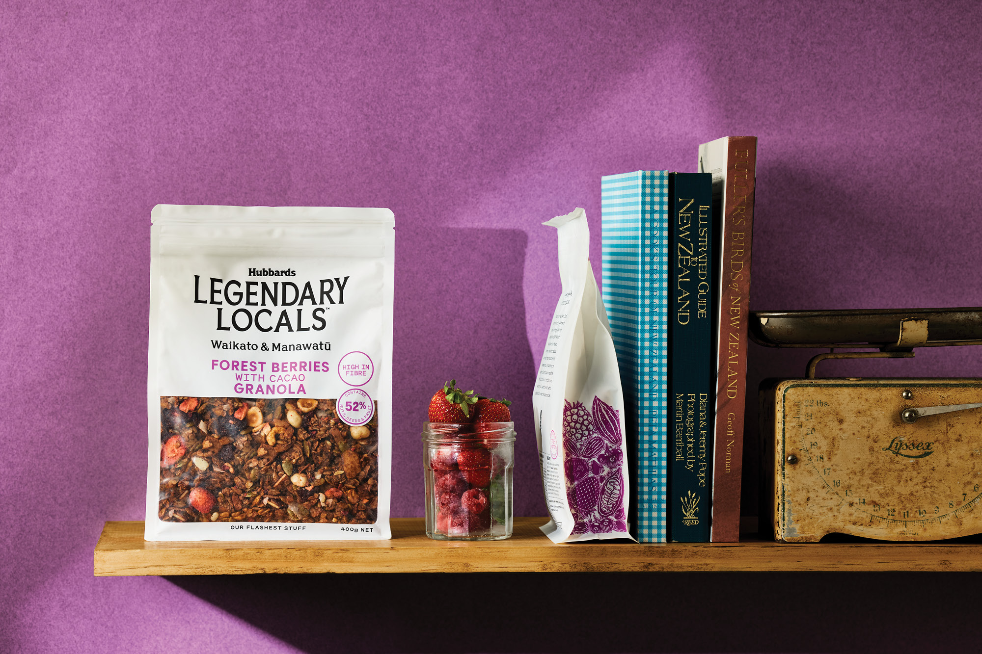
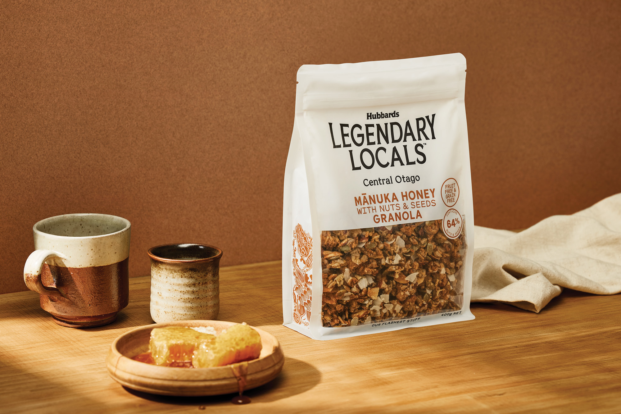
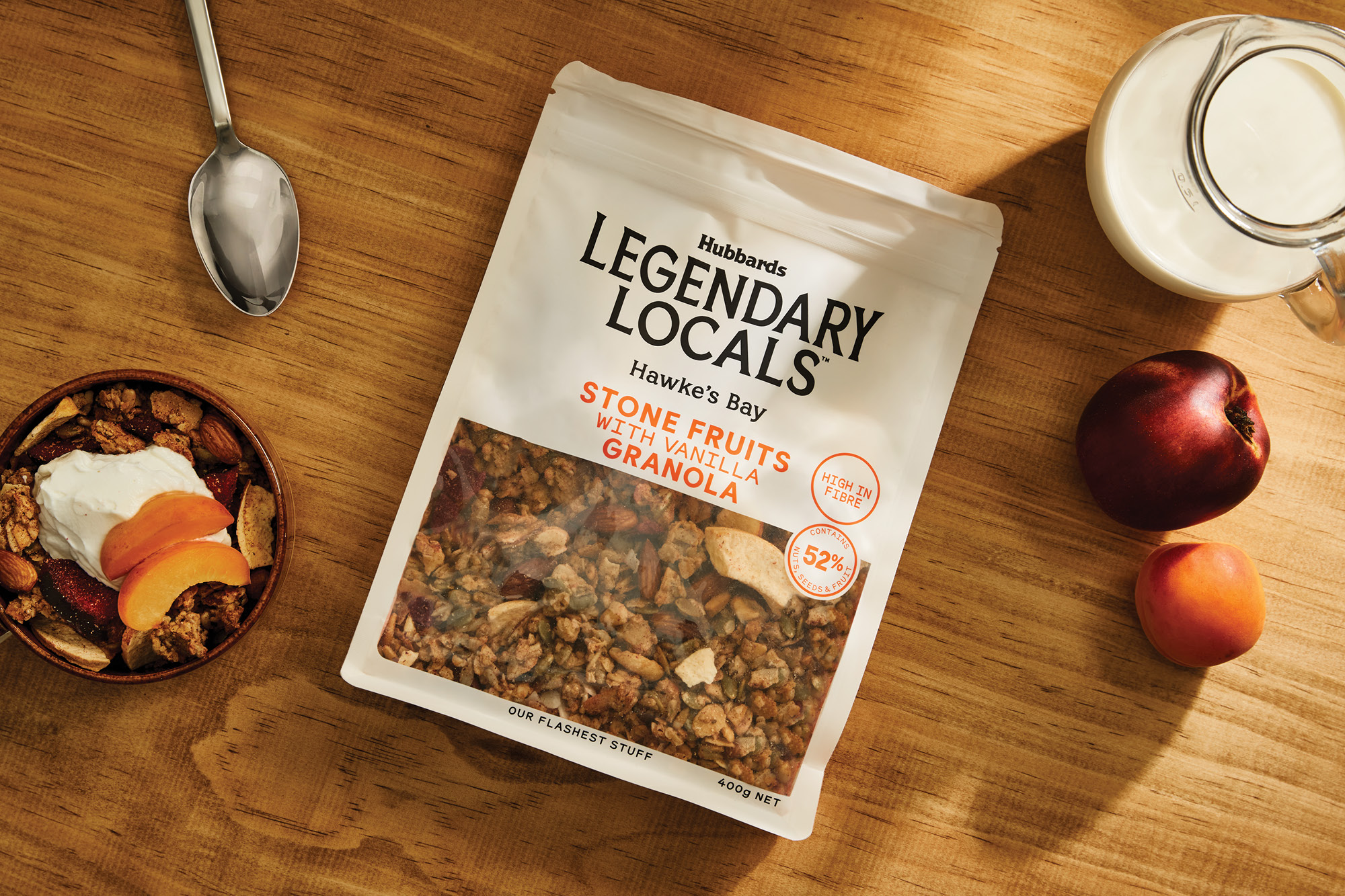
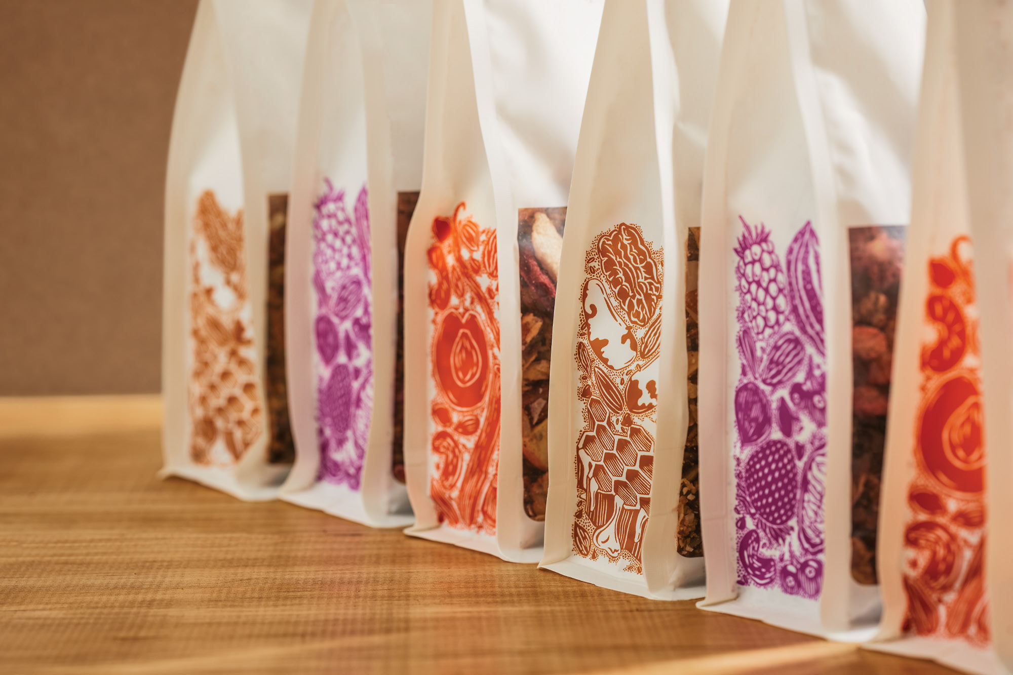
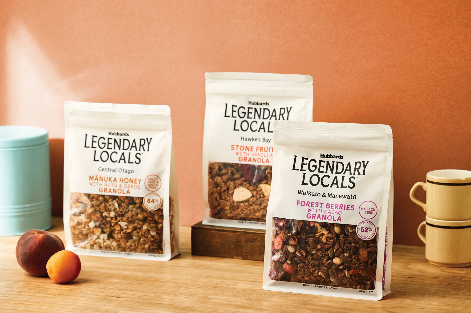
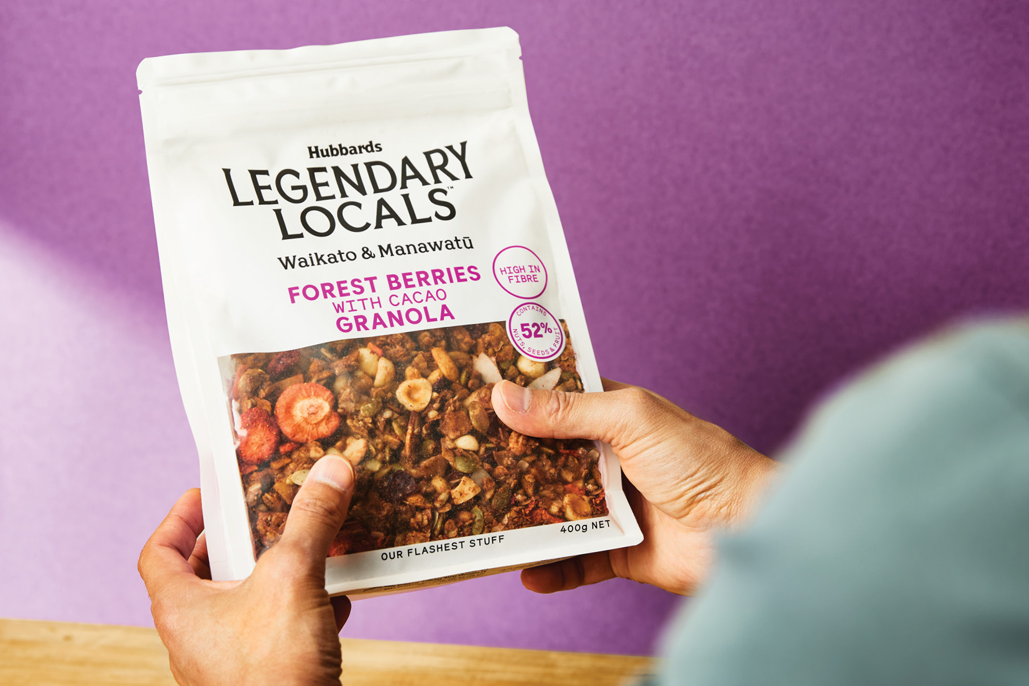
We positioned this new range in typical Hubbards fashion. For Kiwi's, being ‘legendary’ is a moniker used for people, experiences and food that are genuinely exceptional, unexpected and dependable. Honest and down-to-earth, the packaging is all about showcasing the beautiful granola while eliminating all the usual embellishments that are used in this price category. Premium but unpretentious. The mix of typography is refined, understated and quintessentially Kiwi, which champions each region. This careful mix of type allows the granola to sell the premise in an oversized window. This is Hubbards at it’s understated best!
