Old Country Food
A fusion of cultures
Old Country Food has been making authentic Asian food of the highest quality for over 30 years for New Zealanders. The brand draws on traditional Chinese recipes, flavours and production techniques to bring an authentic taste of Asia to Kiwi kitchens. These are created with locally sourced ingredients – a true fusion of Asia and Aotearoa.
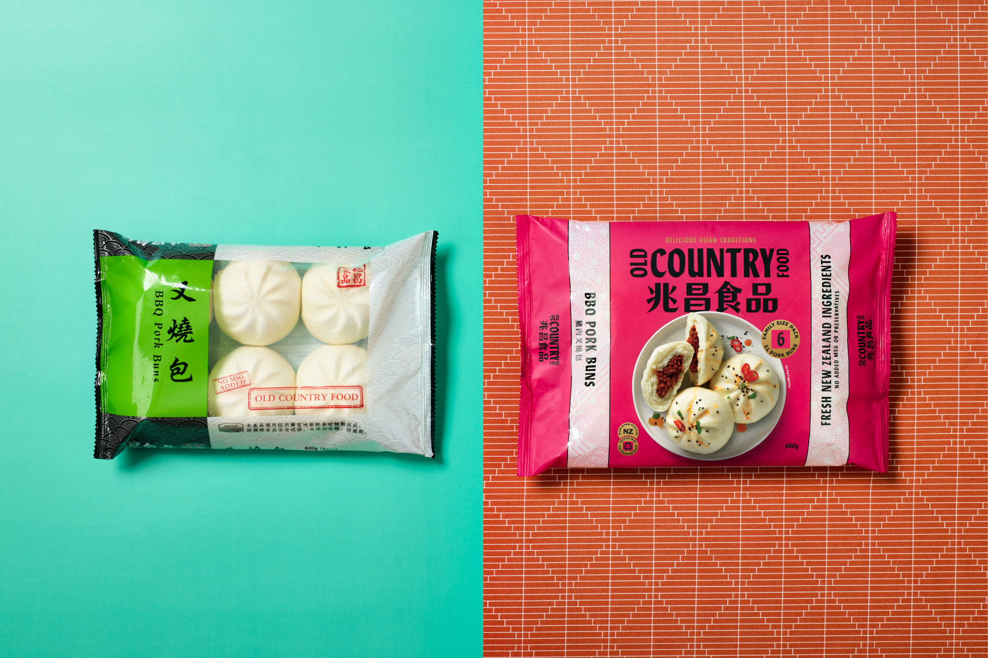
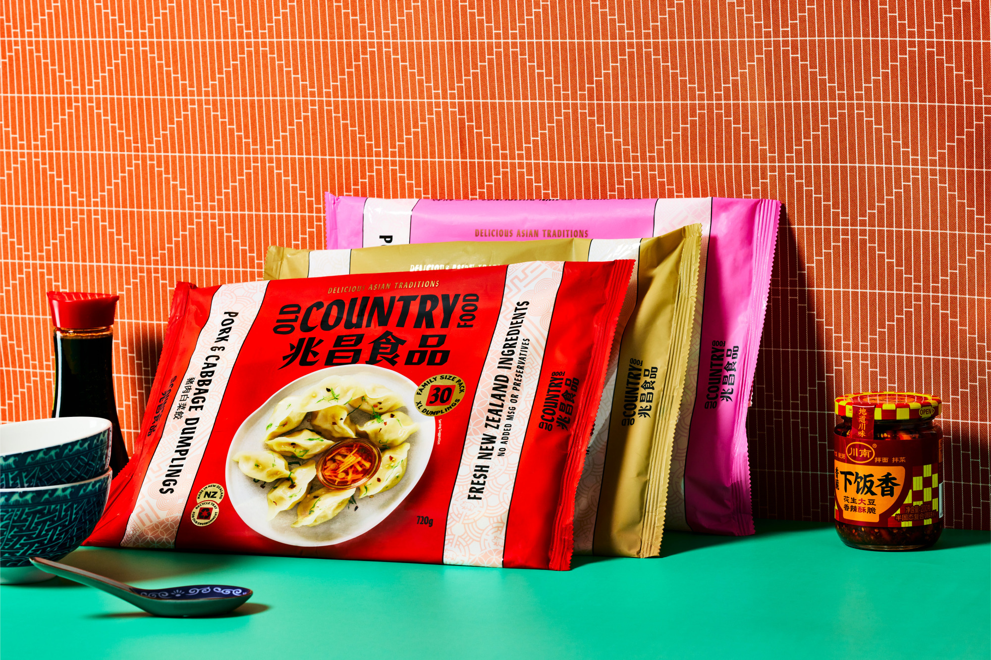
The brand and packaging have been virtually untouched for several years and compared to retail competitors, the proposition and quality were not communicated. We worked to develop a new strategy for the brand targeting the modern foodie consumer, ‘Delicious traditions’ gave us a new direction capturing the flavours, styles and quality.
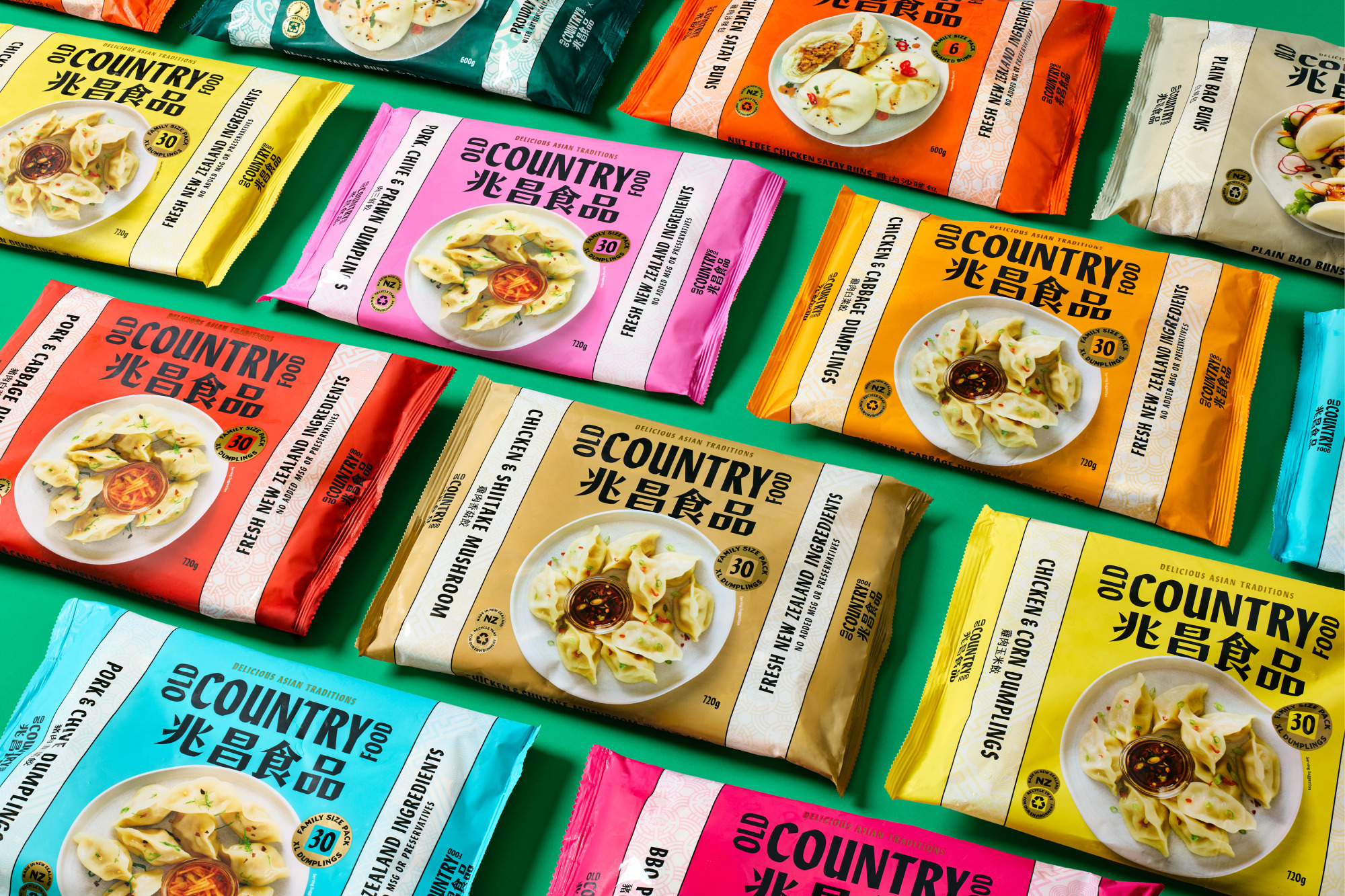
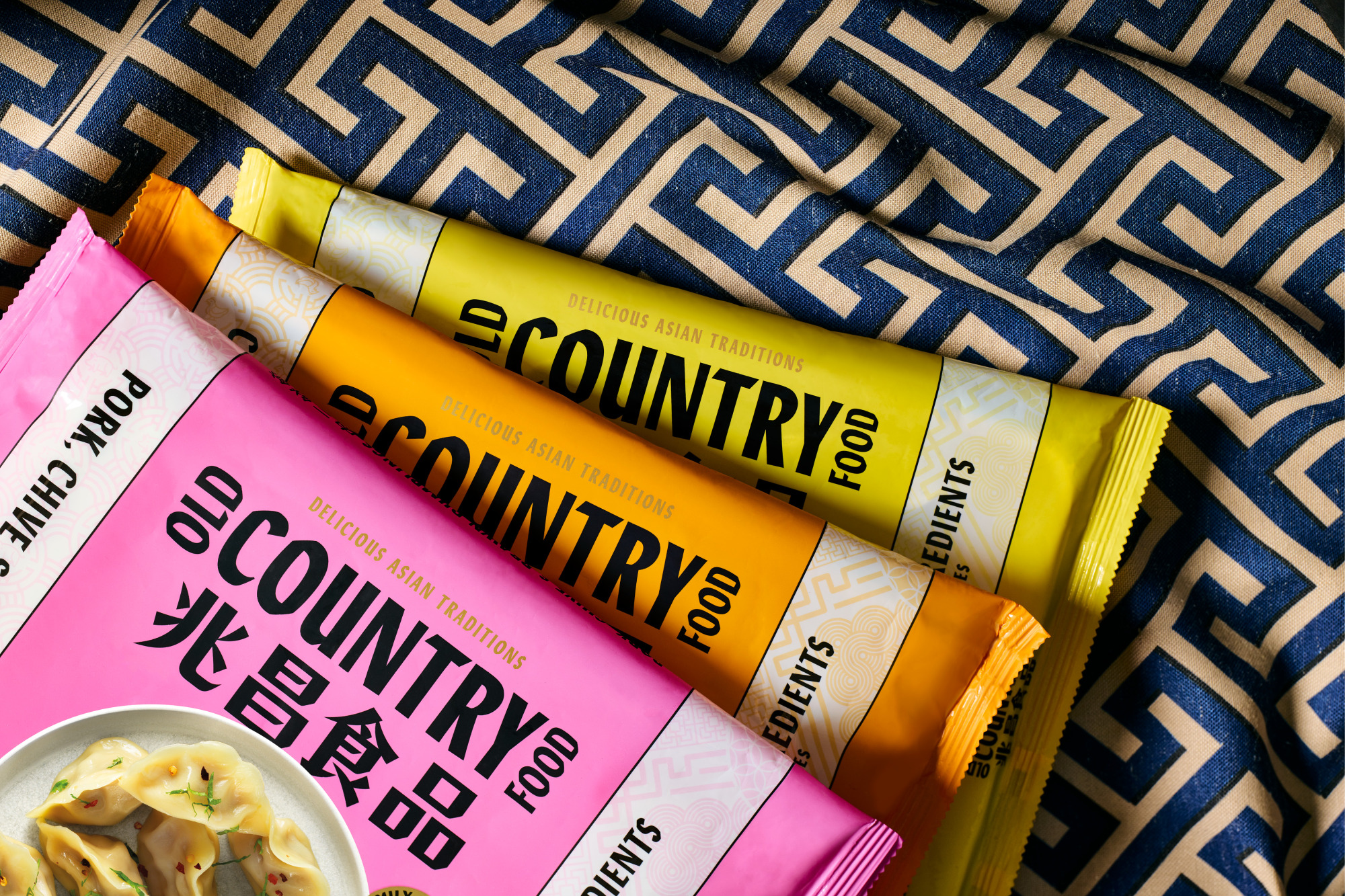
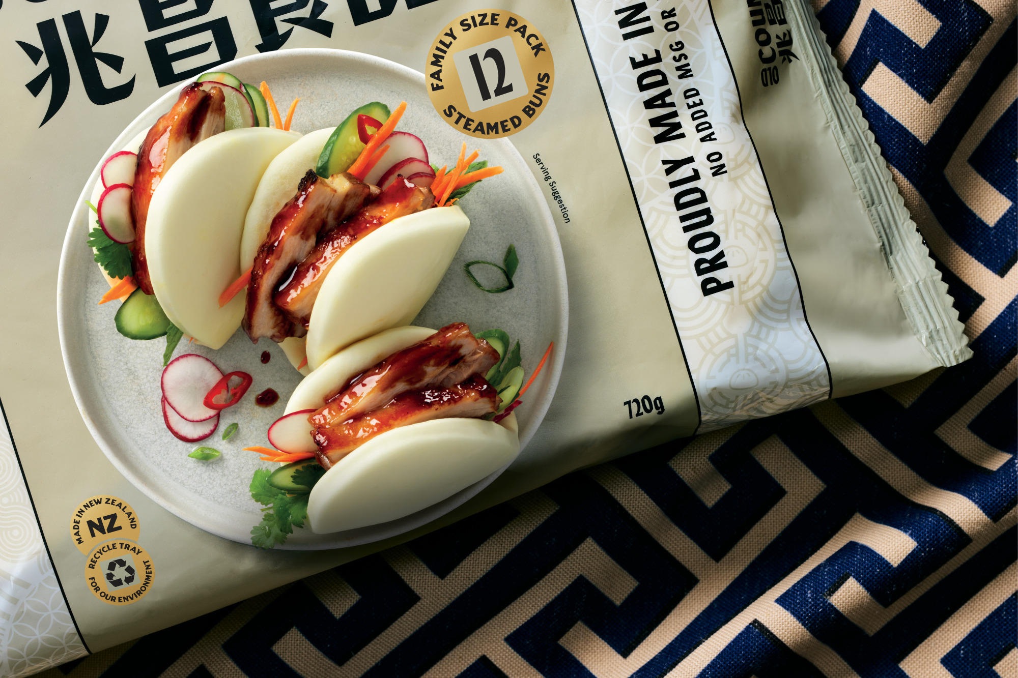
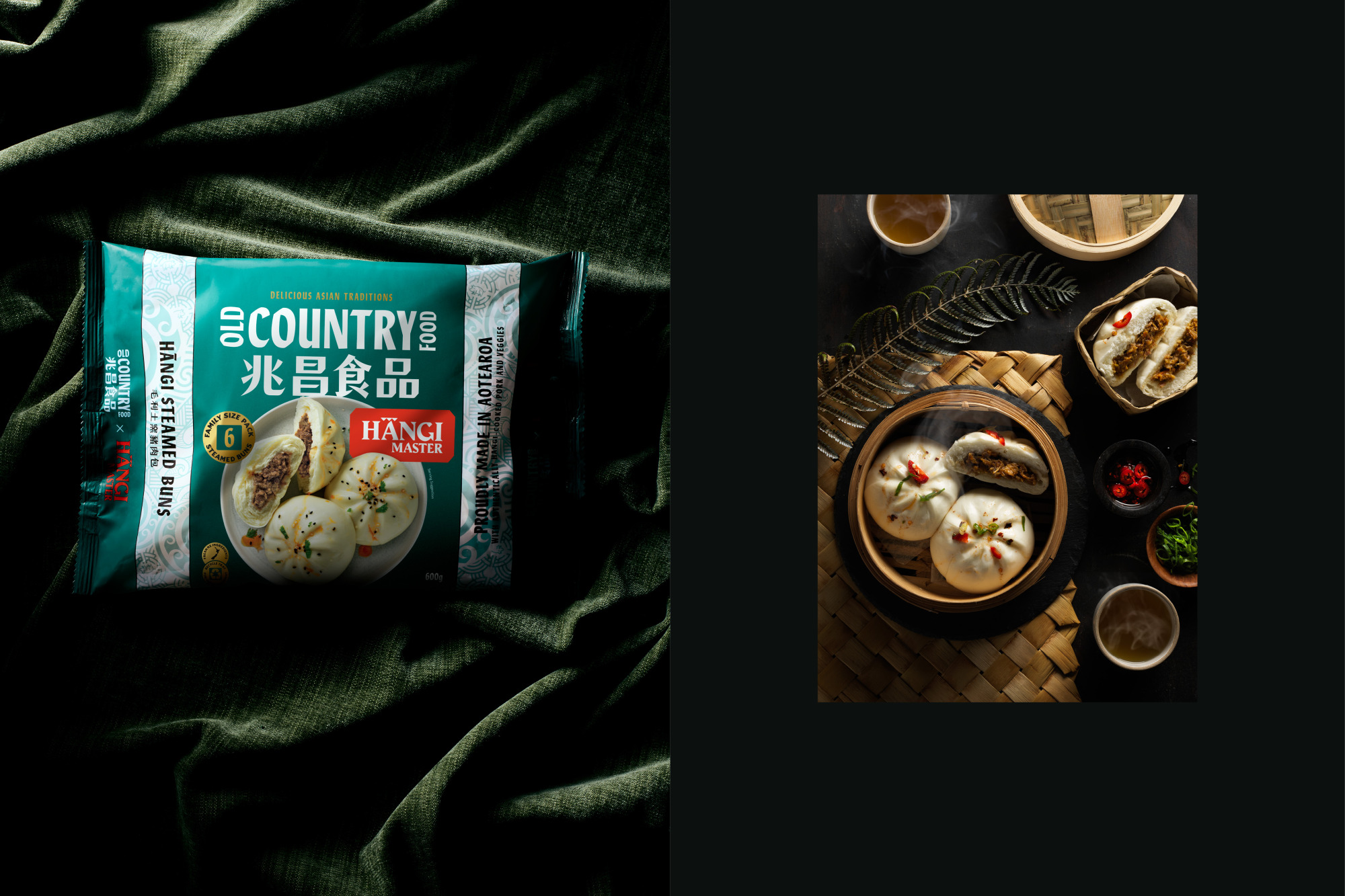
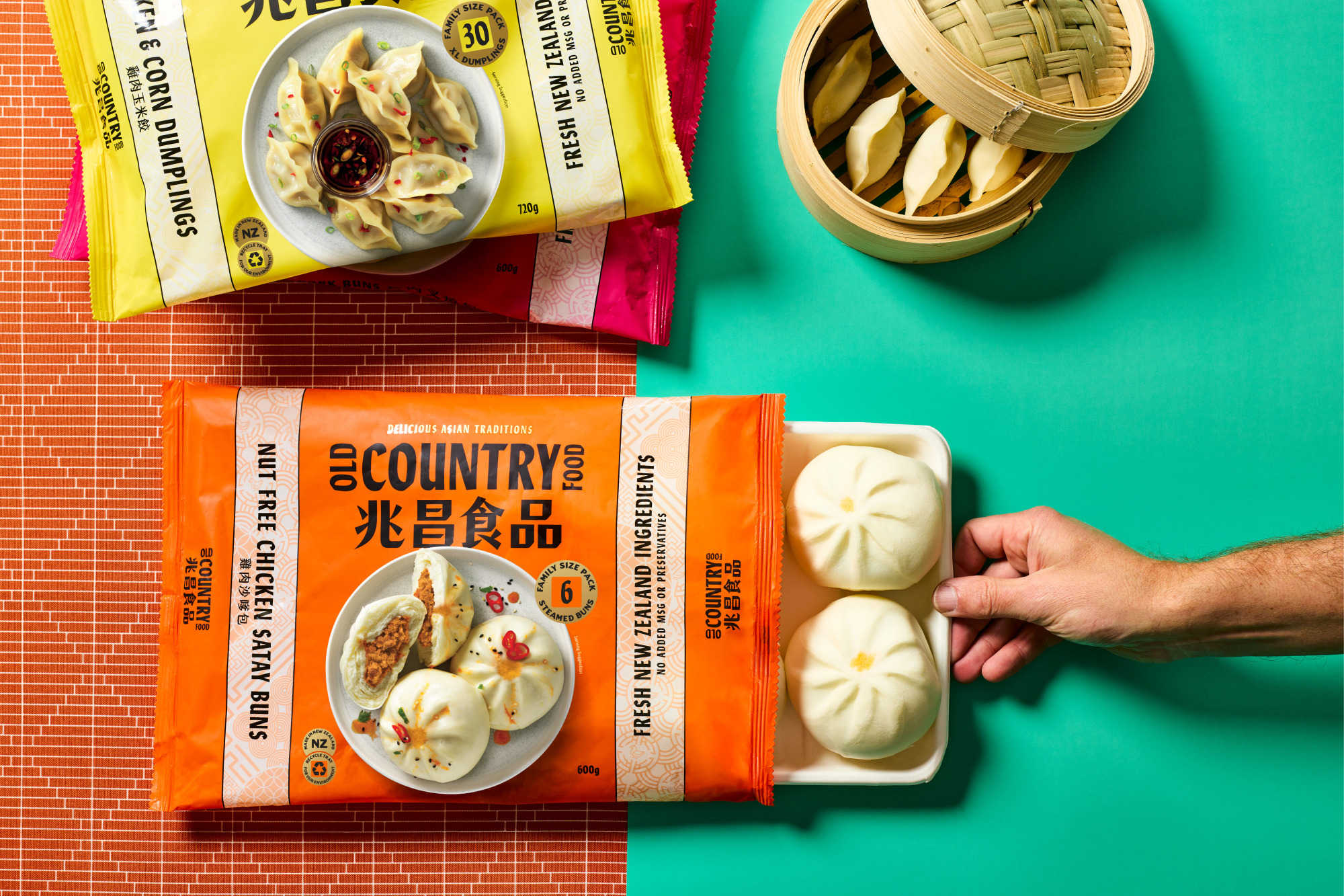
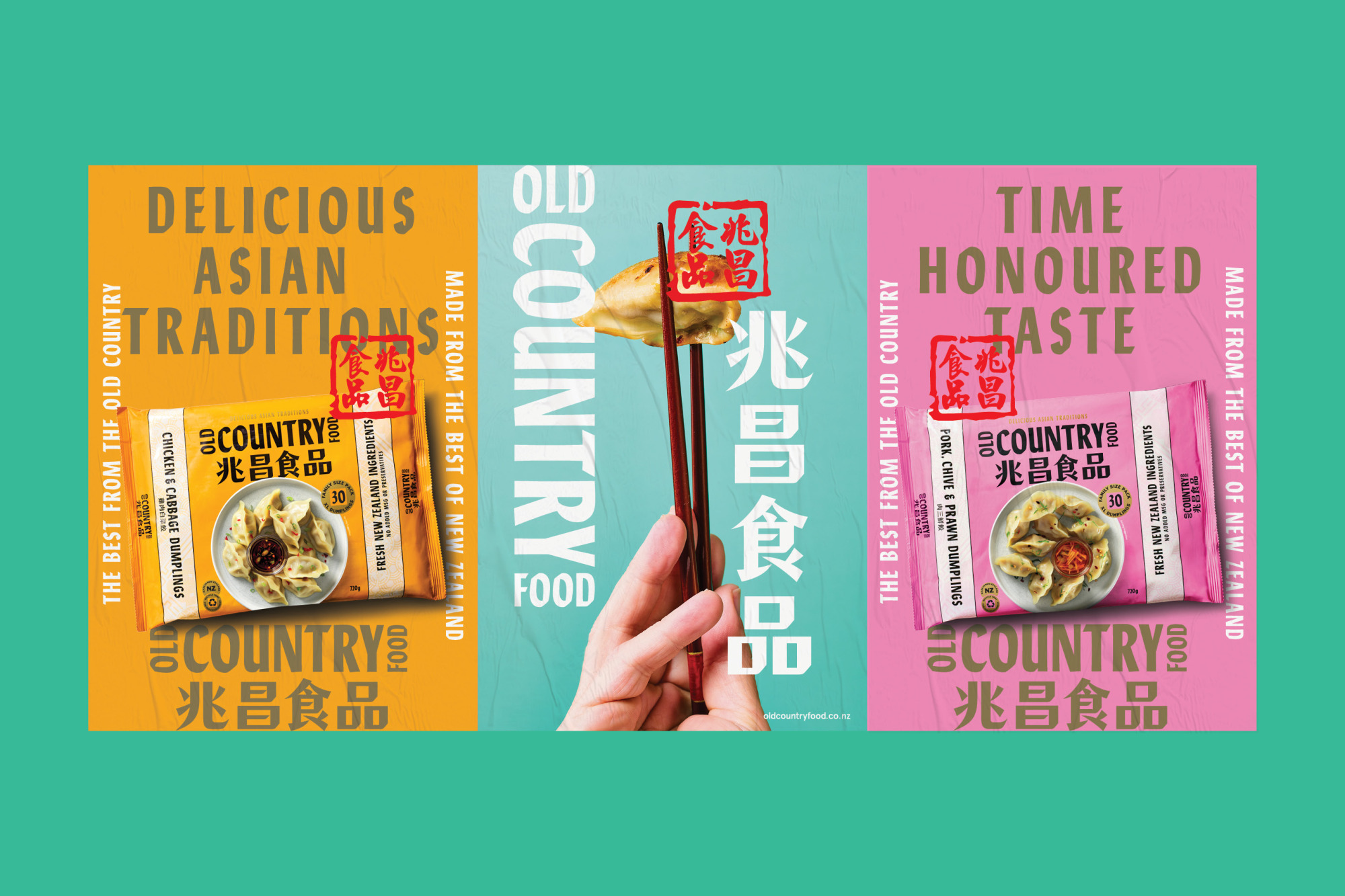
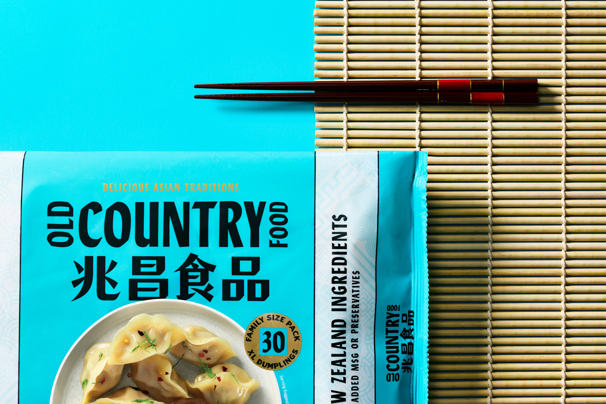
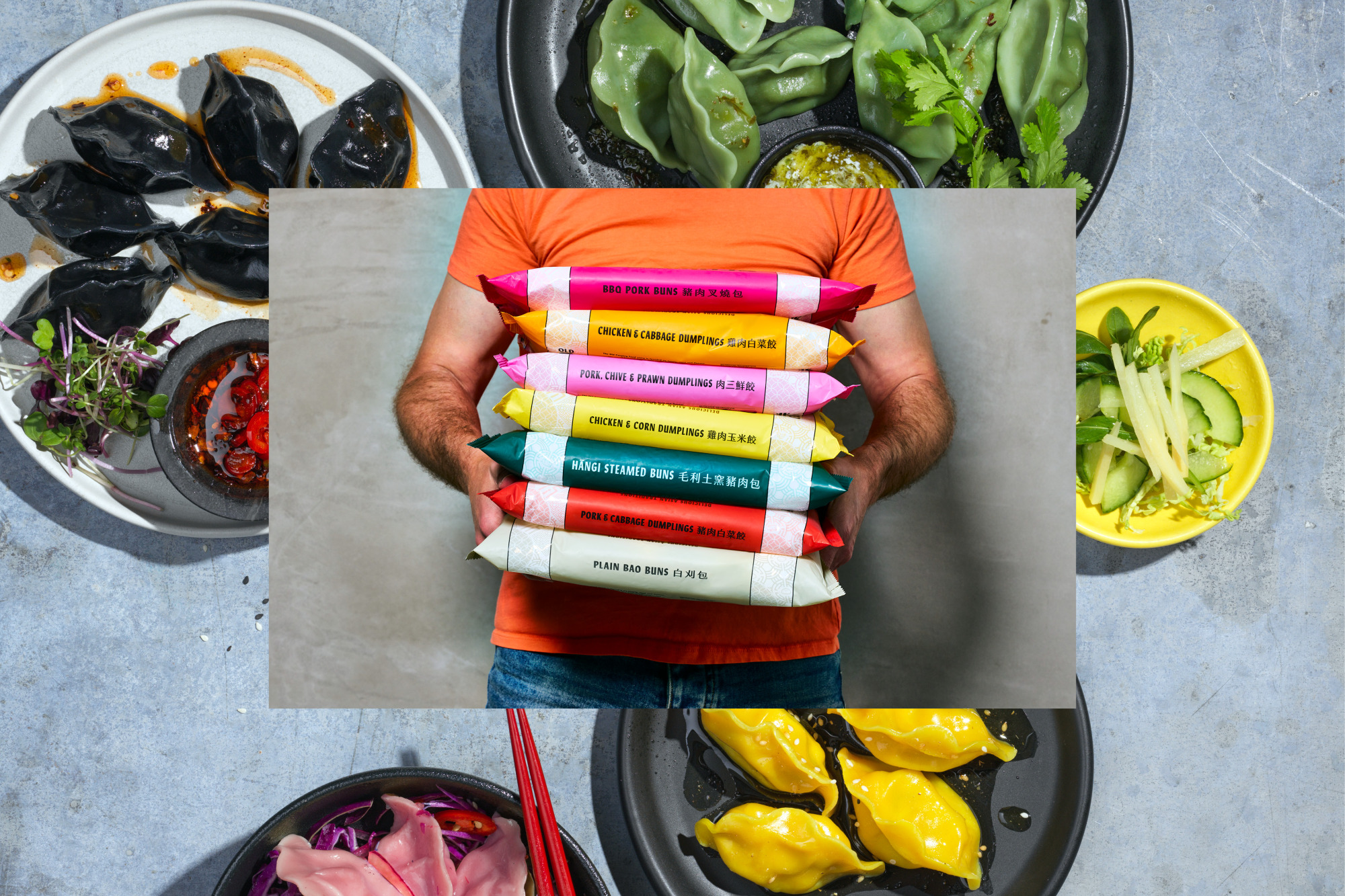
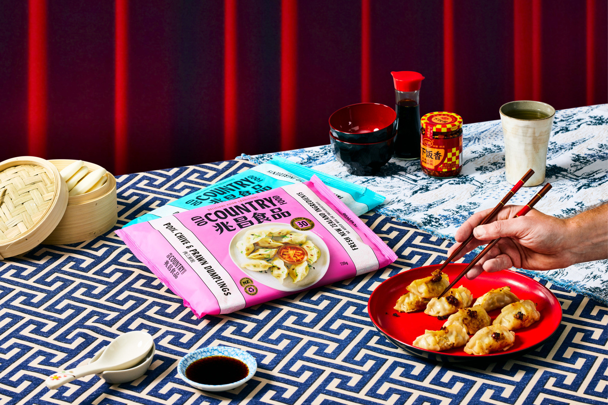
Old Country Food was reimagined as the perfect fusion of two countries. A bold dual-language wordmark which can be used horizontally and vertically was created and takes pride of place on packaging. A bright, high-contrast colour palette inspired by Chinese fabrics and embroidery was developed to stand out in supermarket freezers and help range navigation. This changes to darker tones for products such as Hāngi Steamed Buns, which relate to the rich and smokey flavours. Side banners contain key flavour and health callouts, creating space for serving suggestion photography. The result is a brand that now displays its affinity of two nations and new visual assets that are bold, assertive and attention-grabbing. We also aided the team with moving packaging materials away from their previous substrates. The outer is now soft plastic compliant, while the inner tray can be put directly into kerbside recycling.
The brand has enjoyed immediate success across retail, gaining new ranging and stockists throughout New Zealand, with particular media attention given to the Hangi Bun offering. New stockists and NPD to follow in 2023.
