Sinch e-Bikes
Further, Faster, Easier.
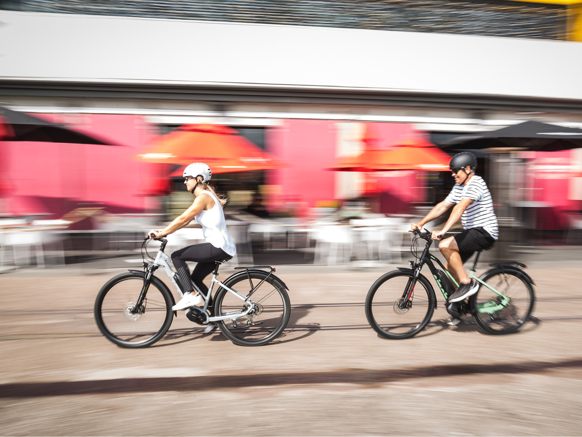
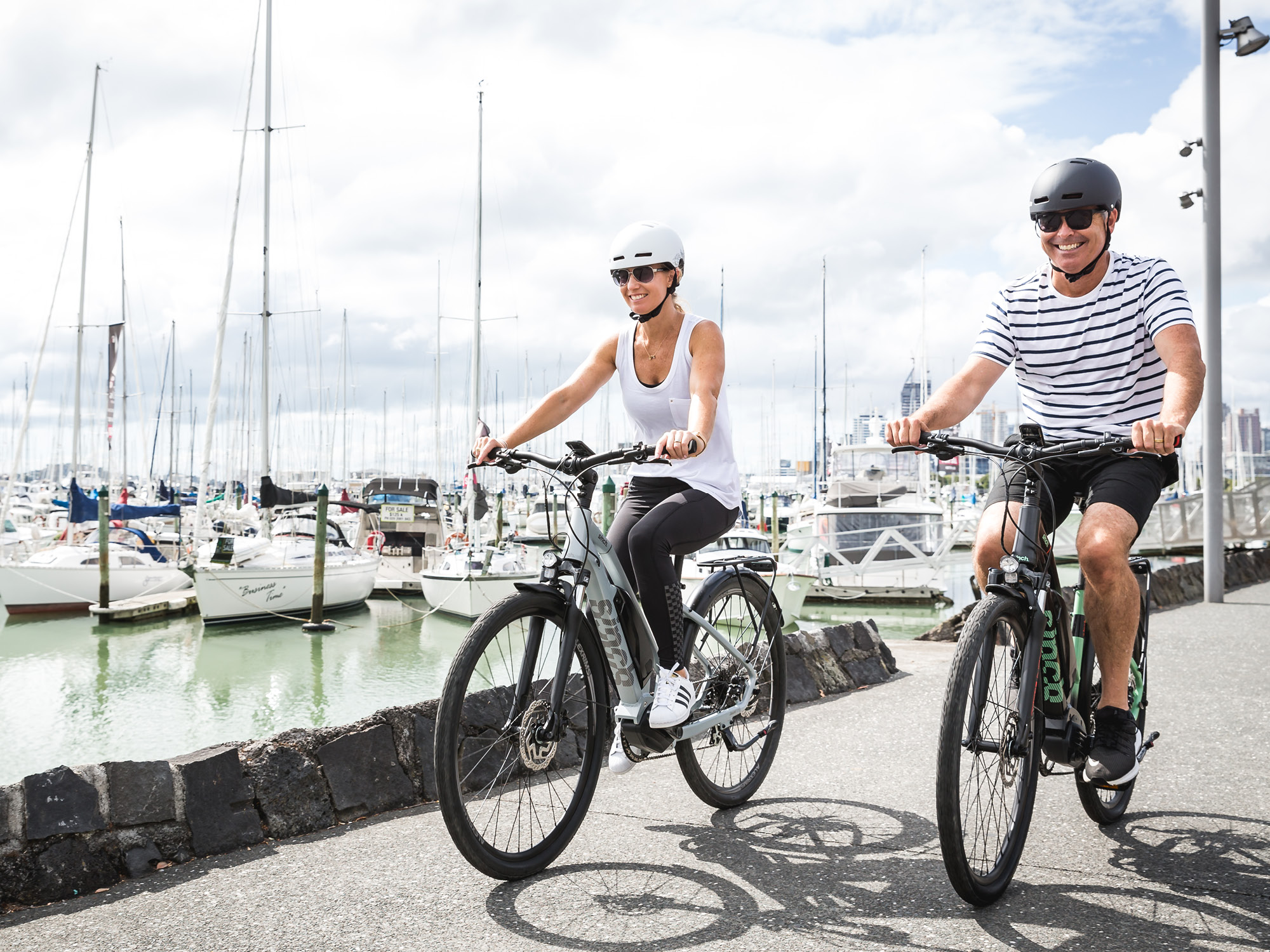
The demand for alternative transport is growing, with e-bikes quickly becoming the transportation option for urban commuters, weekend riders and off-road grafters. Having previously gained vast knowledge of the industry as part of an international cycle brand, two entrepreneurs developed a business model for a new e-bike range. With several global brands offering e-bikes, these tended to be overpriced, too technical for the everyday consumer or with a limited product range. This new brand would democratise this - keeping the offering as simple as possible, with a more accessible product range for the whole family that is affordable and enjoyable.
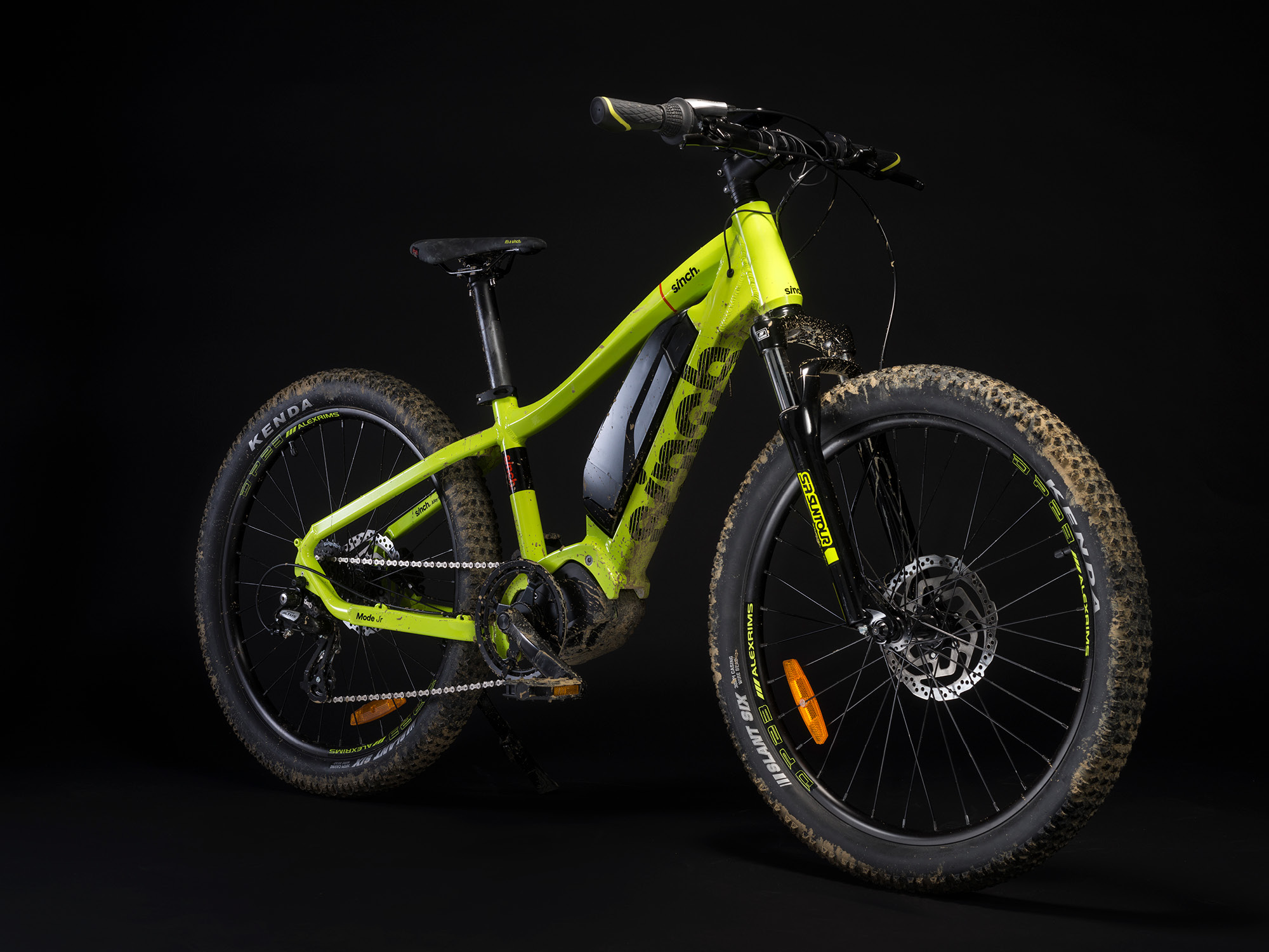
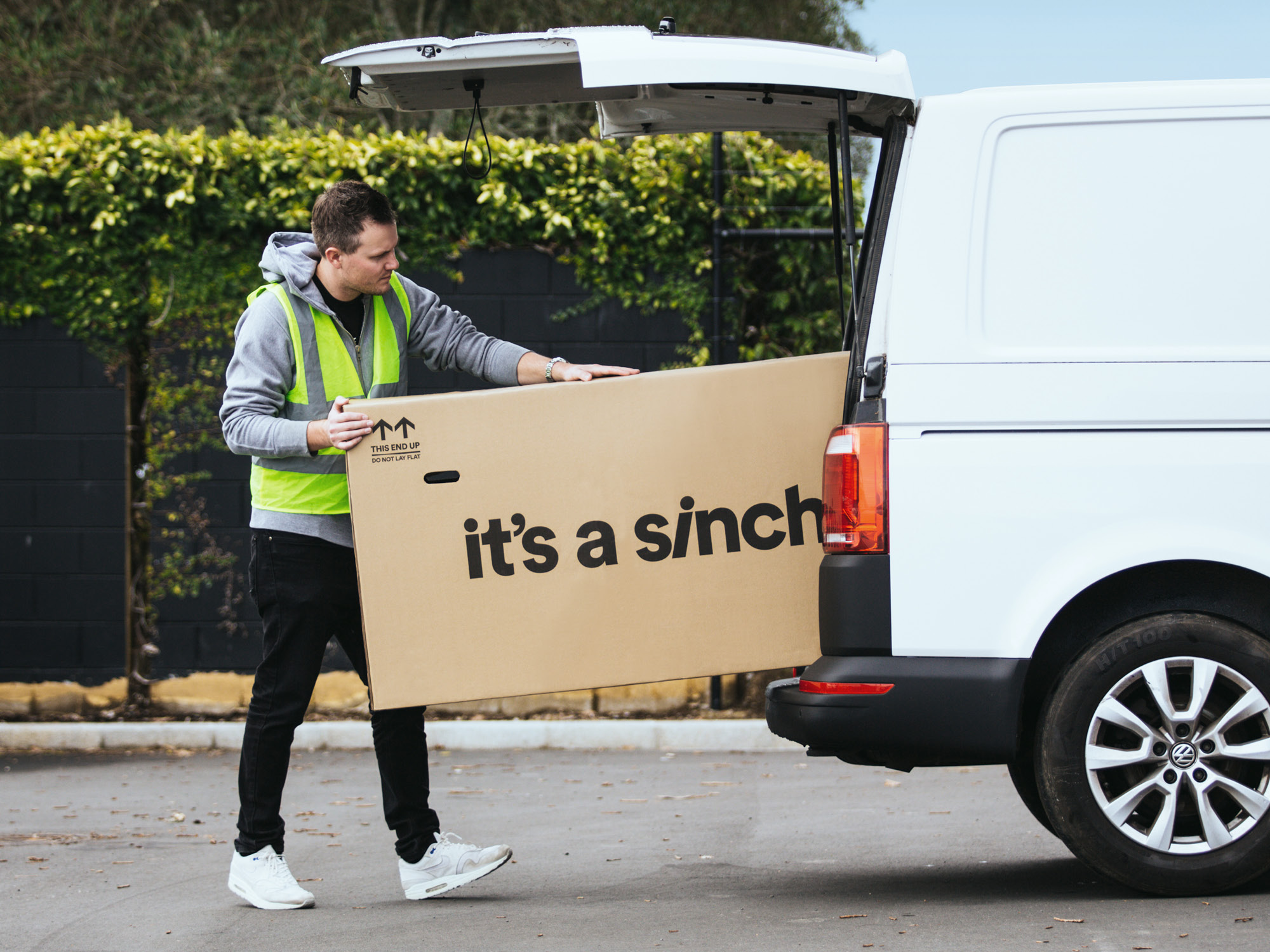
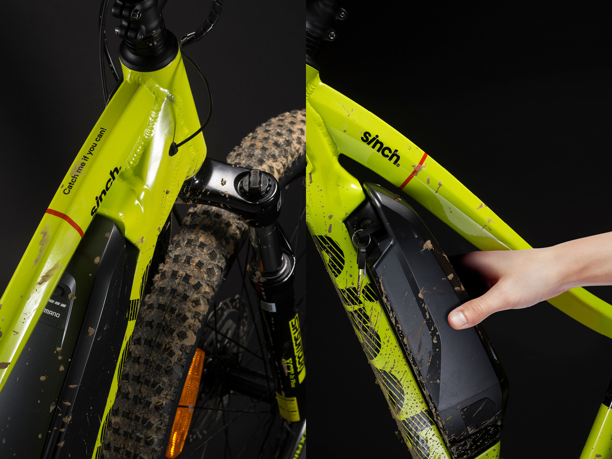
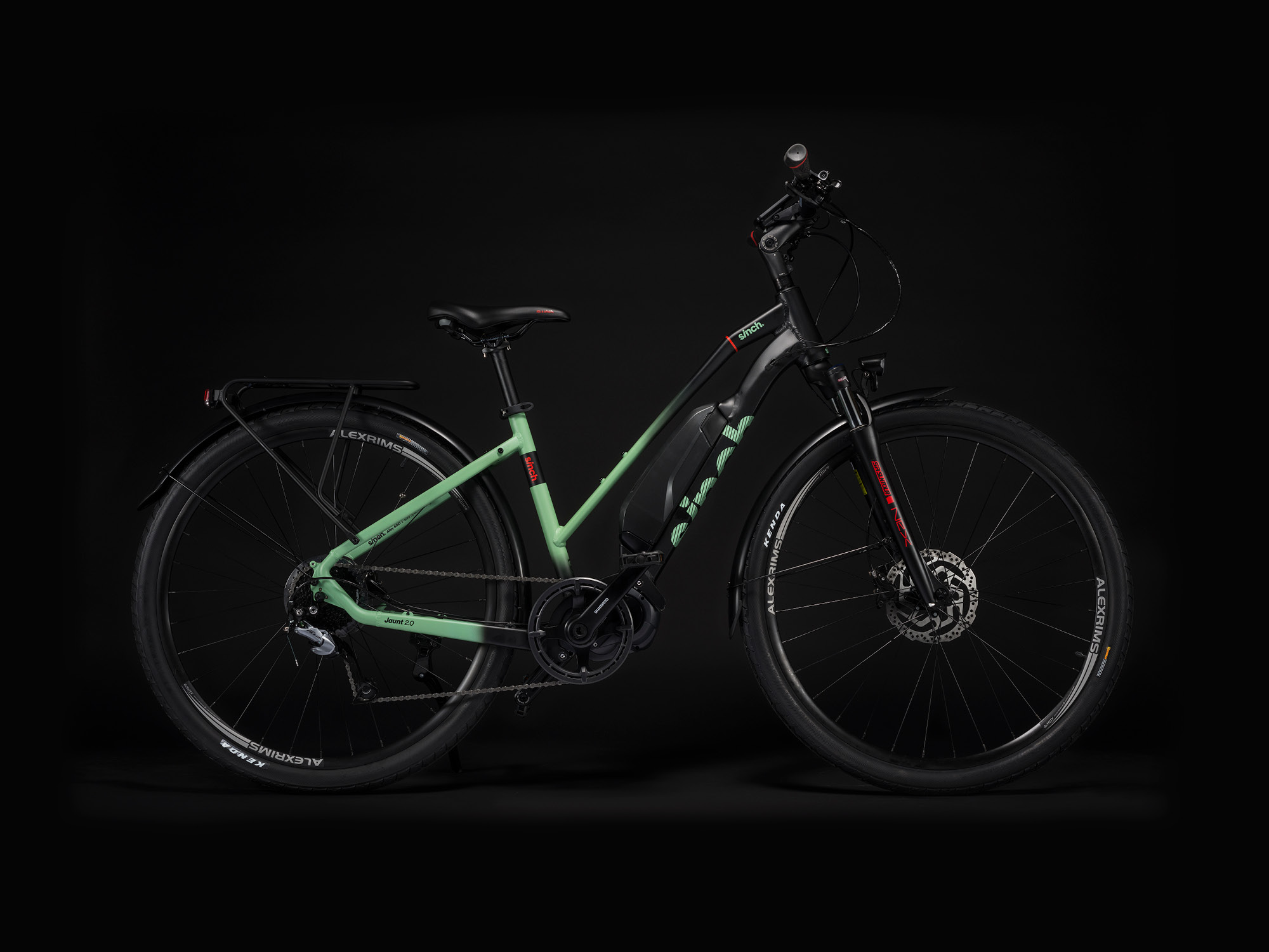
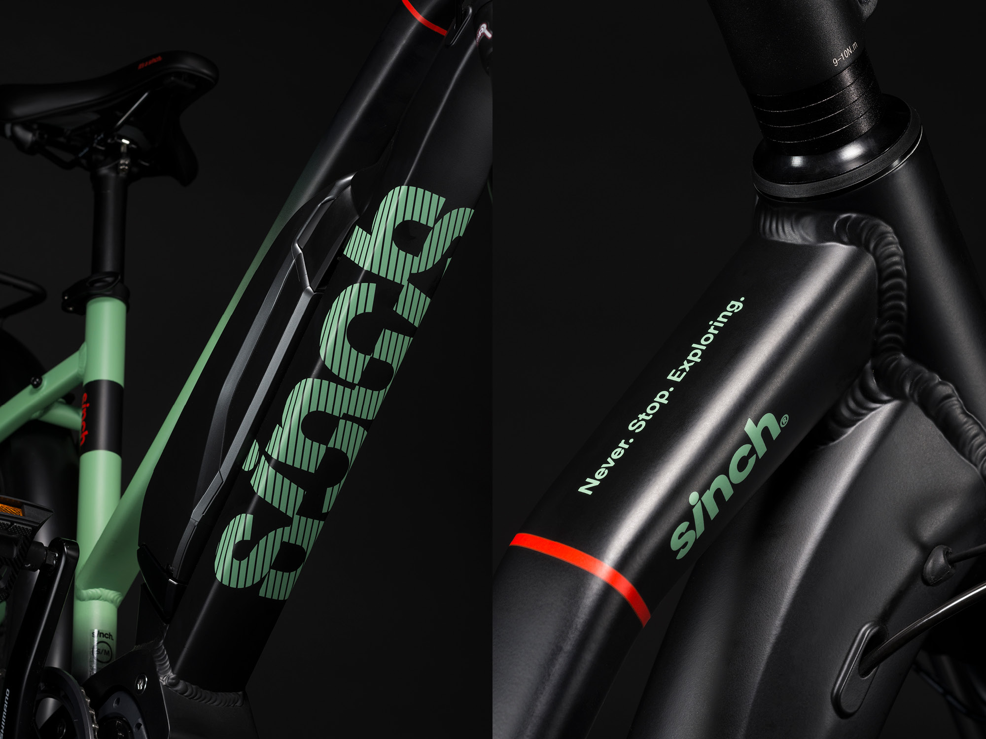
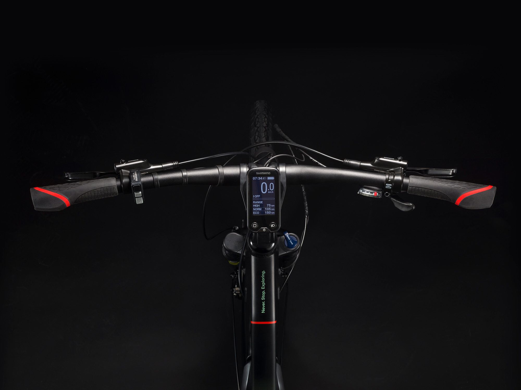
We were tasked with naming this new venture and bringing it to life with bicycle graphics, brand tone-of-voice and communication to help the New Zealand launch. The name was inspired by the emotive feeling that the consumer will feel from the functionality of the bikes. The powerful battery that takes the effort out of pedalling and allows for long trips. The Shimano drive motor that helps the consumer conquer hills easily while the bike geometry and seat design mean that the rider is always comfortable. These bikes make cycling (and getting outdoors) easy, uncomplicated and fun; in short, these bikes make it a Sinch!
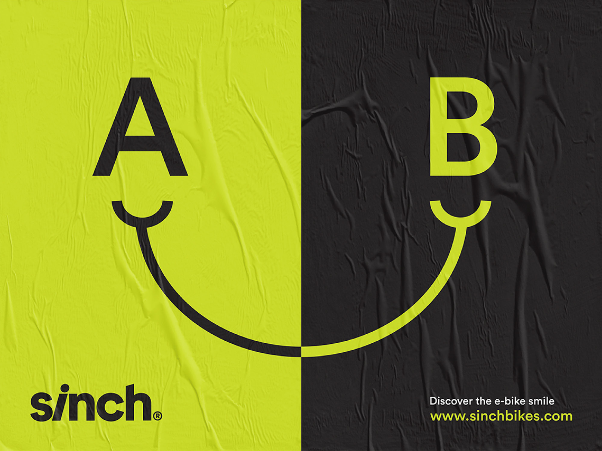
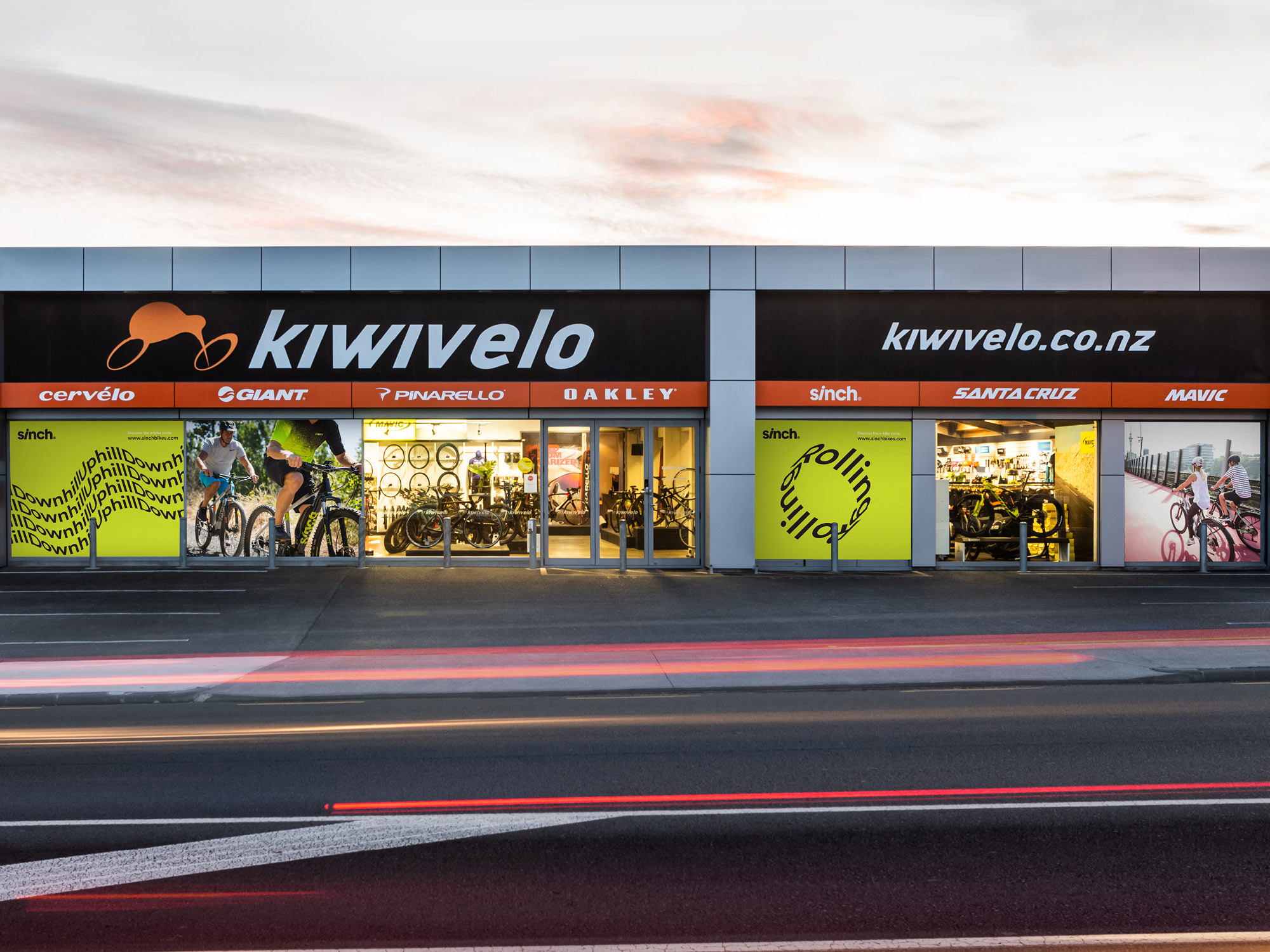
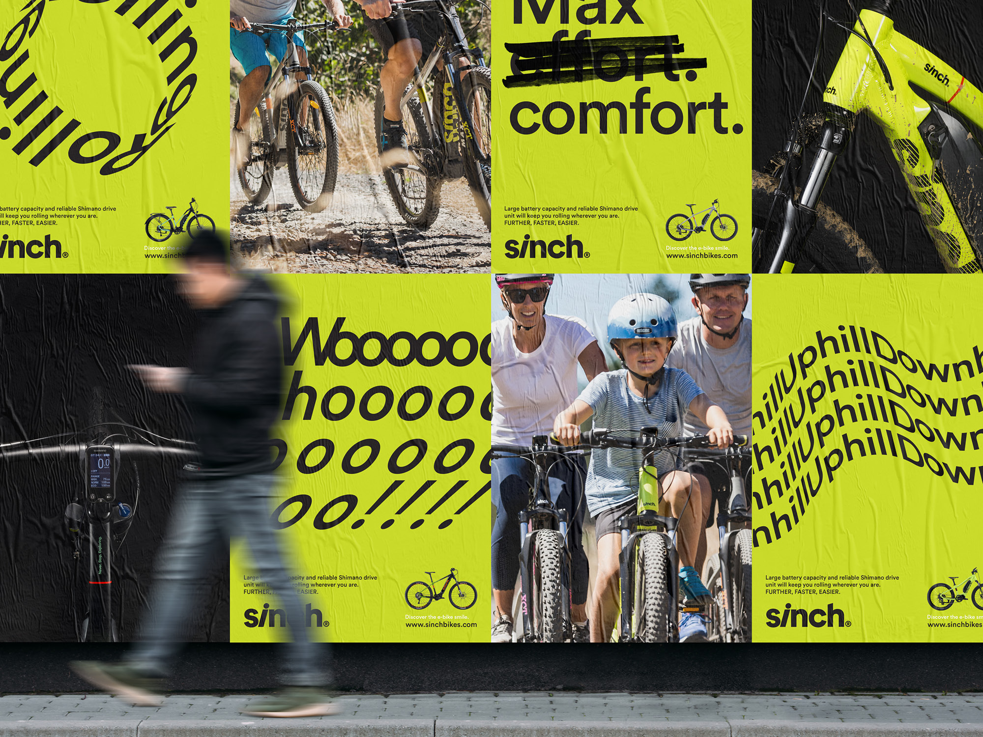
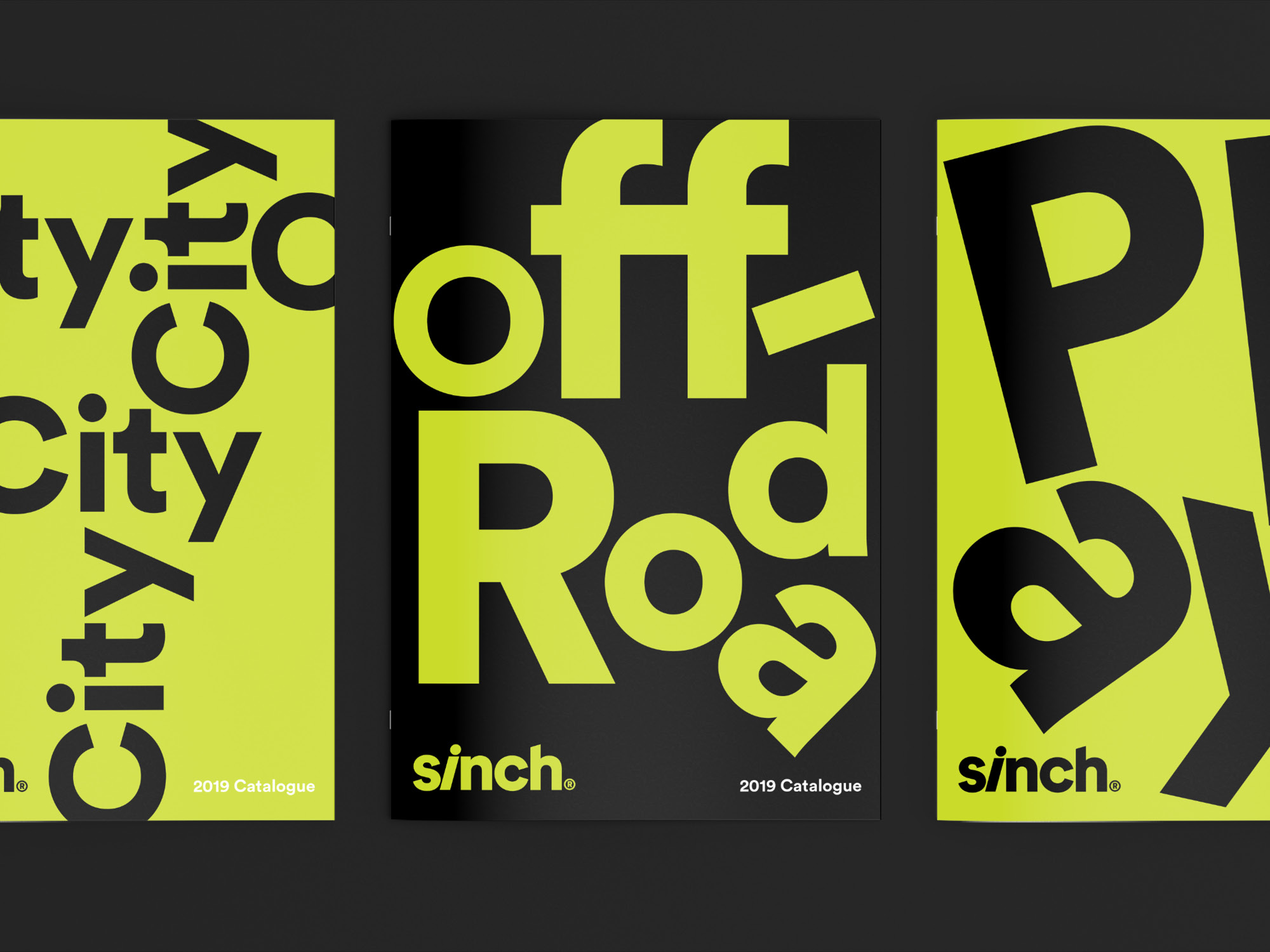
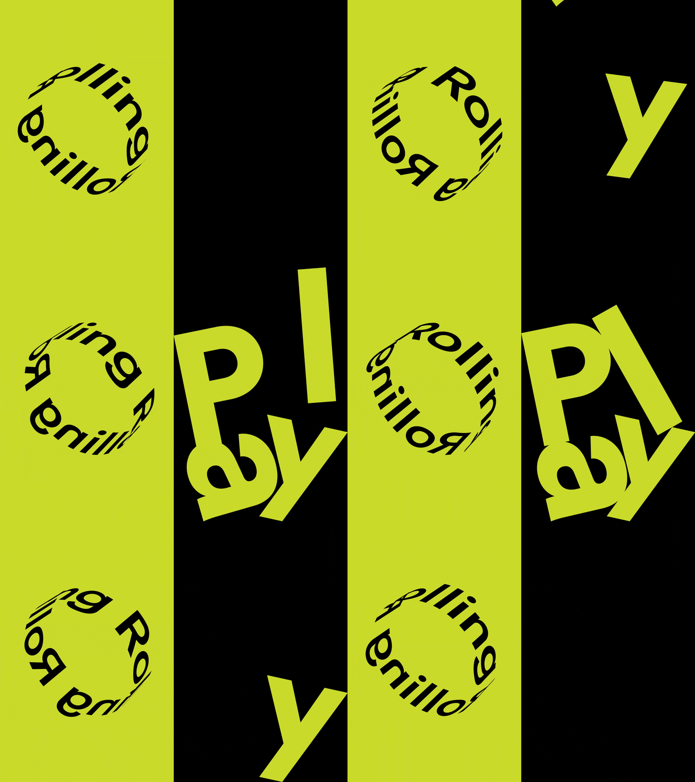
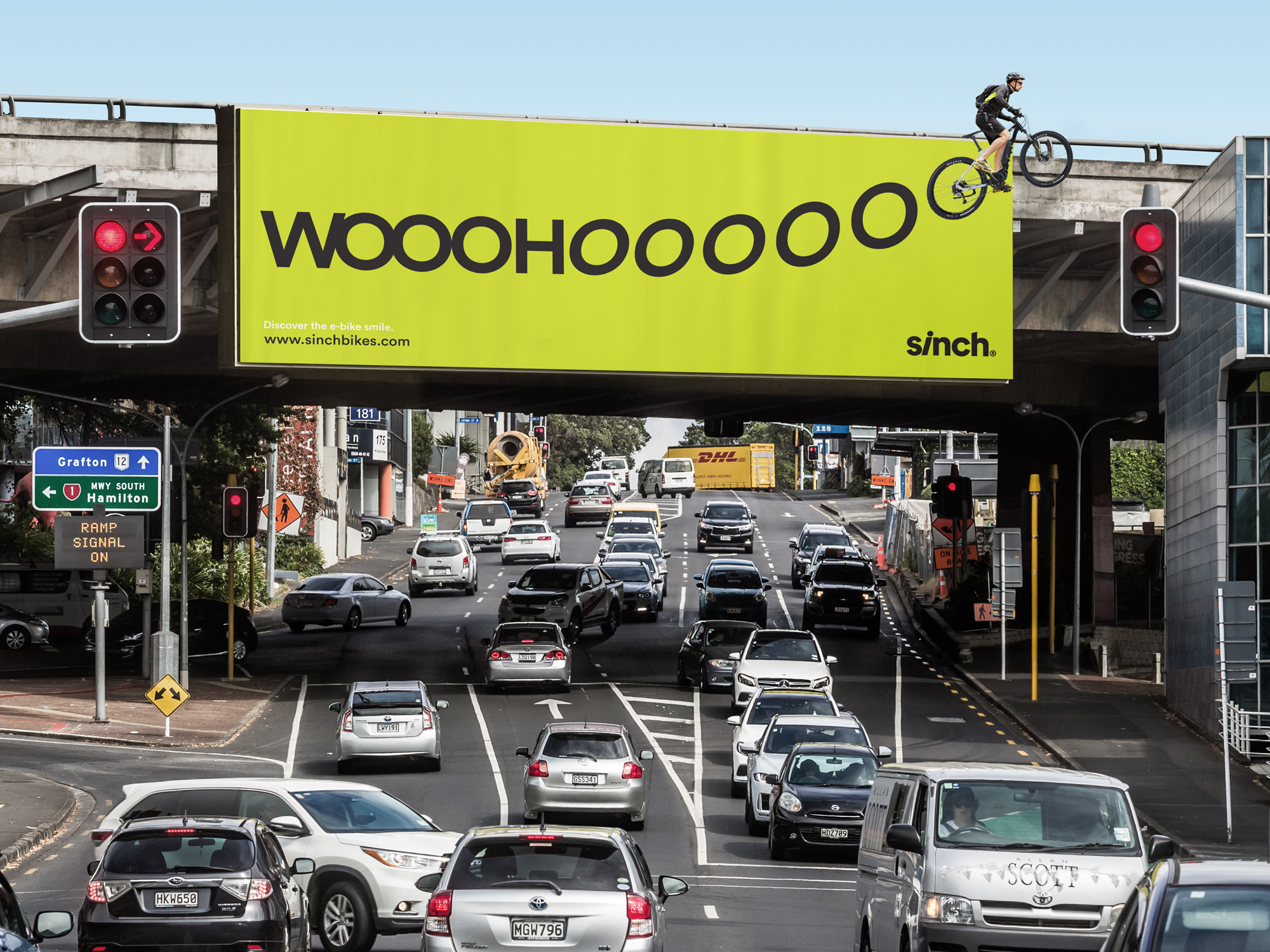
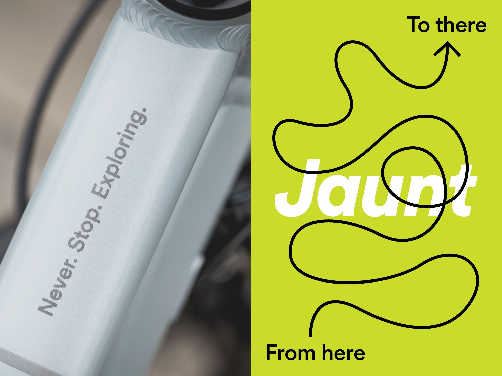
Brand language is kept simple, bold and impactful. With a minimal colour palette, a single font family is used throughout communications. Statements are brought to life with lively and playful typography; each one reinforces the core brand values of making e-bikes easy and straightforward. The result of owning a Sinch bike is to experience the e-bike smile!
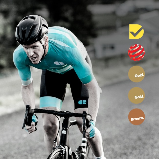
Awards
