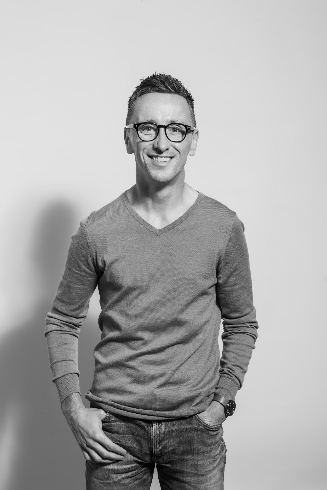
Under The Hood With… Matt Grantham, Creative Director of Onfire Design
Ahead of the next Under The Hood April event, Design Assembly caught up with Matt Grantham to speak about the recent brand refresh for Talbot Forest Cheese.

First things first, can you tell us a little about your background, and how did you first get started in the industry?
English born and bred. I studied Communication Media (a fancy name for graphic design back in the 90s) in the idyllic small town of Maidstone, Kent, just outside London. Then moved into London to do a Masters’s at Central Saint Martins for a year; this was bizarrely paid for by Pfizers Pharmaceuticals – long story. I came out of education securely in the mind that I would do product or structural design, but I quickly discovered a love for packaging in one of my first studios in London, Fitch. Back then, it was a huge, genuinely multi-disciplinary, agency working in product, environmental, architectural and brand design. It was here that I got thrown in with one of the packaging design teams creating the structural and packaging design for a new Head and Shoulders shampoo range. Since then, brand and packaging design have been my ‘thing’. I moved around a few studios in London for a few years, one blow-out year in a studio in Amsterdam and even a hilariously disastrous (and short) stint as a junior scriptwriter at the BBC – you have to try these things sometimes! I arrived in Auckland after travelling, thinking I would stay for a year or two. That was in 2000, and have never left.
What project will you be presenting in Under the Hood?
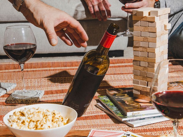
I will be going through our recent brand refresh for Talbot Forest Cheese. A recently launched project, hitting supermarkets’ cheese shelves in November 2021. This was one of Onfire’s highlights of the previous year. The brief came in with a tight timeframe for concept sign-off, but a client who was genuinely open to creating a unique New Zealand brand that would challenge the expectations in the speciality cheese category.

What was the most challenging part of the project and what lessons did you draw from it?
There are a few well-trodden and expected tropes in the speciality cheese category. Variations upon the theme of ‘craft’ and ‘artisan’ permeate throughout the cheese shelves and instore barges. The big challenge was to create a brand and pack design that indeed spoke to these themes but did not regurgitate the same language. Or from another perspective, acknowledging some of the critical attributes which consumers shop in this area, but breaking or challenging some rules to create a distinct point-of-difference. The latter was helped with a very open-minded brief that asked for disruption and uniqueness. For the studio, this was a lesson in layering our messaging, careful use of typography and allowing a BIG idea to do all the disruptive heavy lifting.
Was there an ‘Aha!’ moment in the project when things clicked and fell into place?
There is always an ‘Aha’ moment, and it can be back-breaking, frustrating and (a little bit) tear-inducing until it happens. But it does happen! For this project, it was a serendipitous moment pouring over territory boards – one which focused on botanical illustrations and a board that had some early examples of woodblock printing. Both worked well individually as a possible direction, but the decision to trial the early 20th-century monotone woodblock type into which we interweaved the forest flora, fauna and birdlife illustrations had us excited from the get-go.

Now that the project has finished, what are you working on?
Here’s the thing with Onfire, we are never ‘not busy’. While the last year has been challenging with a particular pandemic, lock-downs and looking at each through computer monitors, several varied projects have come through. We do as much brand and corporate work as we do packaging, which greatly adds to our weekly work schedules. One that is very exciting for us is an overseas project which has been with us for nearly a year now. This project has given us amazing learnings about developing for an entirely different country and culture. We are into the final lap(s) of this, so watch this space.


What insights to your methodological approach or philosophy can you give us?
While we have specific set procedures and processes, we never apply the same methodology to each project. All our clients are unique in their own way, from big national or multi-national conglomerates to single owner-operators. It is immersing ourselves in their business, their product and understanding their consumer. It is a core philosophy of Onfire to know, understand and love the business of each of our clients and as well as they know, understand and love it themselves.
Outside of work hours what creative projects and/or hobbies are you involved with?
I have quite an extensive design library at home (I’m a sucker for book buying in art shops around Auckland), so I nearly always have my nose in one in some downtime. I have a big passion for movies and cinema visits. A result of a hyperactive disorder as a child, I do some sort of sport activity each day to expel pent-up energy. Despite getting older, lying to myself that the aches and pains are okay and my knees won’t give way and generally wondering why the younger ones in my running club seem to be getting faster and faster.
And finally, where to next for you? What areas of your work or personal development are you hoping to explore further?
Since joining Onfire nearly five years ago, it has been a fantastic journey improving myself and growing the business. And we are by no means finished yet. The last couple of years have seen several new clients, and projects are unique for the studio and, frankly, new for me. To bring these in, build a small team to tackle these, mould a culture that is innately true to us as a studio and develop my own skills is a daily and weekly challenge.


